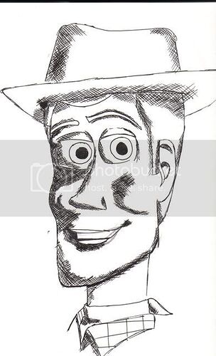
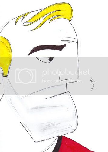
Not too shabby! Its good that your trying different angles, such as the 3/4 Woody turn. ![]()
Not bad captain Pan. I could recognize alot logos on that first one. Really cool and creative.
I’m loving those logos! They work so well. And I agree with CMB, it’s cool that you’re trying different angles for the characters. You’ve got the shape of Woody’s head down really well.
AWESOMENESS on the first one with the crossover logos! Very creative and amazingly put together. That’s got to be my favorite one you’ve gone so far.
Woody and Zurg are nice and neat, too. I like how you did Woody from a different angle besides just facing foward.
Thanks for the comments… its actually nice to have people actually comment on my work, and understanding what and where the passion for the subject comes from.
Lizardgirl I only hope I had read your comment before I did my latest Pixar Drawing, maybe i would have inspired me to get the shape and details right before I inked him in…
Here’s Why
In my opinion it is a travesty to what is one of my ALL TIME Favourite Characters in Cinematic History
but here’s something to give my spirit a minor lift
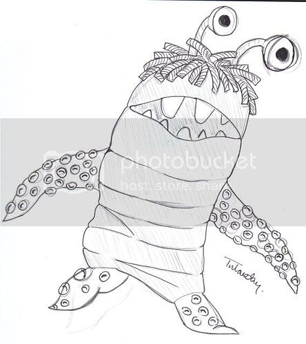
Captain Pan- Haha, it’s not that bad! The chin is a little off, but the nose and eyes look good. And Boo looks incredibly sweet! I love how you’ve drawn the little tentacle suckers.
Thanks Lizardgirl at least someone can see the light in all the doom and gloom I have surrounded myself when I see something not quite right with my pictures…
That Boo is one of my all time favourite drawings that I’ve done, and in colouring I feel I have taken it in the wrong direction and should have left it as you have all seen it…
Well here’s some more
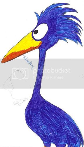
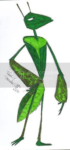
Another great bunch right there. I like the different shades of green coexisting on the last one, the expression on George’s face in the first one, and the bird looks neat in the middle, especially how you added just a little bit a light blue so it’s not all plain. (Whoops, I commented to them out of order…oh well) Good job.
Thanks bright dot-dasher, Thanks for the comment, and on that note I don’t care what order you comment on them, as long as there’s a comment!
Well here are the dregs and final Pixar themed ones already complete… But got a day off from Uni so who knows more doodles may come out of it…
I’ve for some reason had problems making the Characters from Cars Work on page… Although I am quite proud of the one I am currently drawing…
But There’s Something Missing in my opinion for these ones
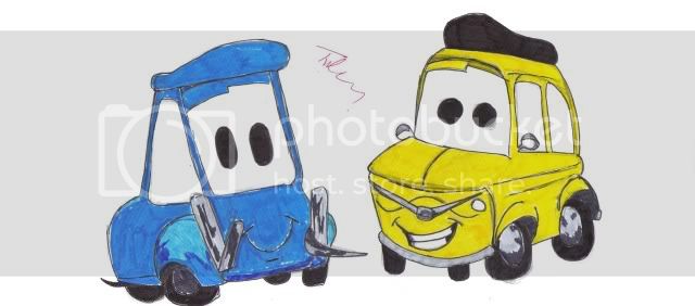
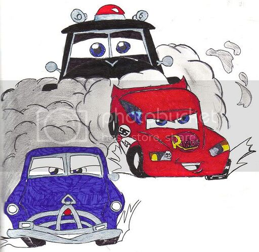
OOoh, now that is really clever! Really cool picture. Got the action feeling of racing combined with the classic characters from Cars.
Nice drawing, Captain Pan! I especially like the composition of this one, and the expression on Lightning’s face is awesome.
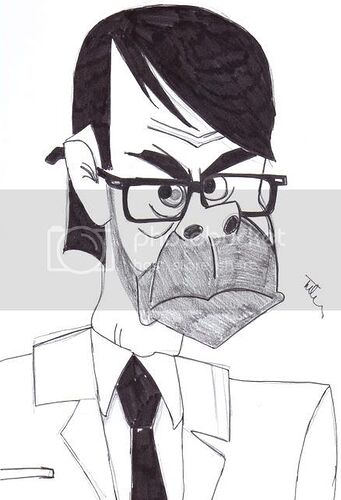
Really excellent job on the Cars artwork! They look so good, and you got the perspective and angles of the characters to a T. The previous Incredibles ones (Mr. Huph and Bob) are also really well-drawn.
bright dot-dasher, lizardgirl and The Star Swordsman Thanks for the comments especially on the perspectives, angles and expressions. I find that those are the key points for both characters within a Pixar and Disney movies, should they appear wrong they ruin the entire picture!
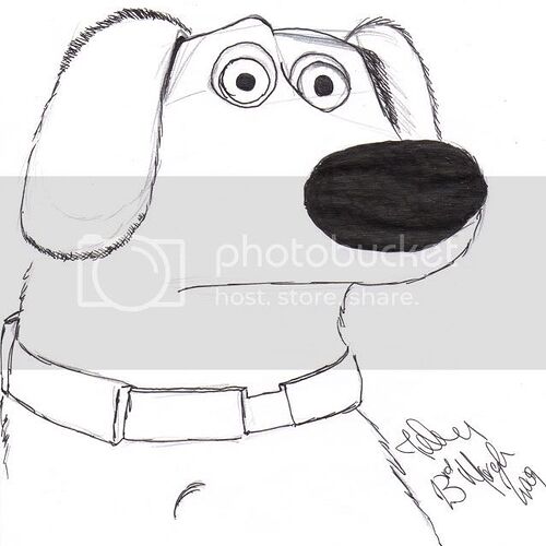
Here’s something a little fresh
Yay, Dug! He looks great! Simplistic lineart that works really well, and just the right amount of furriness.
Oh yes, more Pixar goodness! ![]()
I think you’re great at doing the logo-combination signatures! That’s very original and postmodern-ish, dare-I-say. ![]()
I like your picture of Boo, Dug and Kevin. Very nice and capture the original characters’ look!
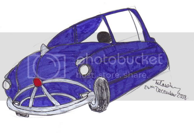
For the portrait of Doc, I think the “Something Missing” would be his left rear tire! ![]()
For the one of Doc and Lightning outrunning the Sheriff, the perspective’s a little off, and Sheriff looks bigger than the other two. Other than that, I liked how you managed to put in the details like the airhorns on Sheriff, the sticker logos on Lightning and the fender grill on Doc. Nice work.
You’re probably the best artist on PP to use colour markers in their work!
Thank You lizardgirl. Its not a bad drawing in my opinion considering I did it in 14 minutes (Exact time I know from the timetable) on a train. Theres something wrong with his eyes… but that could have been the juddering on the track which spoiled that!
thedriveintheatre Thanks for all the comments… some of them are really cool and I graciously accept… one or two I have rebuttle!
Kevin … Is actually Leo from the short For the Birds
Think I’m now going to have to start looking for that Tyre… Where’s the comic book I drew it out of… Actually loking at the picture I drew from… I drew the angle to flat… it should be less of the back seen therefore the tyre shouldn’t be there… So that one is My Fault… D’oh
The one of Doc Lightning and Sherif f wasn’t meant to look like its an action shot… Although it does appear more like a movie poster… which when I drew It I think that was what I was going for.
Thanks for all the comments though!.. And Now I’ve got no Uni work to do till April 27th… I think I’ll relax with some sketches… Hopefully more of the Pixar Persuasion… rather than the Disney so I can post them Here…
Thank you for this cause this is probably the best comment I’ve ever had
I’ve been away from my sketch pad for far too long… and My artwork is starting to show for it…
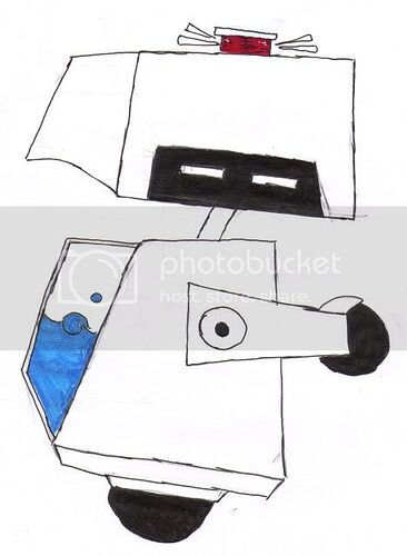
One I’m content with… Everyone’s favourite cleaner…
on the other hand… and to be honest due to Mitch and the constant sight of Russell in his Sig and Avatar…
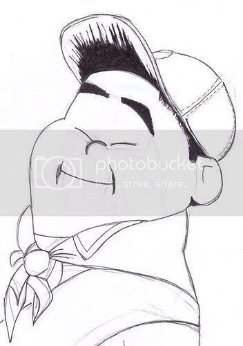
Here’s My First Russell…
a rather rubbish Russell at that
I seriously need some sort of help with this chubby little kid… I just seem to miss the curvy nature and the darn quirkyness of him…
So if anyone can shed some light onto why this is SO Pants… please tell me wether it be in replies or in PMs cause I like the portly little get… and want to give him my best representation/interpretation
And this Russell fondness is again down to you Mitch Russellitis is spreading and is now hazardous to life! ![]()
I like how you do shadows. I absolutely like the one for your username !
