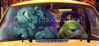
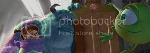
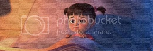
All of the new ones have 3 things in common: They are funy, cute, and creative. I love it Hannahmation.
Mitch: Thanks! Feel free to use any you want. ![]()
lizardgirl, lennonluvr9, and TSS: Thanks so much! I appreciate it! ![]()
You are welcome Hannahmation. I can’t wait to see more.
Hannahmation - You’re welcome, and thanks! I just might wear that Russell one…
– Mitch
Those are nice graphics Hannahmation! I love the “I’m blind!” one with Russel.
I like the first avatar of Dot on the leaf, reminded me of a spread in the "To Infinity and Beyond!’ coffee table book.
The font used in the first Toy Story sig (“You are a toy!”) is Stencil, isn’t it? ![]() Pretty awesome, it’s my favourite sig too from that batch. Was the contrast in lighting between the first and second sig on purpose? (“You are a toy” looks darker than “You are a sad, strange little man…”)
Pretty awesome, it’s my favourite sig too from that batch. Was the contrast in lighting between the first and second sig on purpose? (“You are a toy” looks darker than “You are a sad, strange little man…”)
I also love “I’m Blind!”. Excellent use of Black and White to illustrate Russell’s perception of his surroundings. Any reason why you used orange borders to box the first sig? That screencap of him pulling the bandage with his teeth is funny by the way. ![]()
Thanks, mo!
TDIT: Thanks! I think I know what spread you are talking about in “To Infinity and Beyond”. The font is indeed Stencil. That obvious, huh? ![]() The difference in lighting was mainly me playing around with different photoshop effects. Experimentation.
The difference in lighting was mainly me playing around with different photoshop effects. Experimentation. ![]() And for the first Russell one, I felt like adding some more elements to the sig rather than just leaving it as is. The orange matches part Russell’s uniform.
And for the first Russell one, I felt like adding some more elements to the sig rather than just leaving it as is. The orange matches part Russell’s uniform.
Hannahmation - I couldn’t take it anymore and so made to put on your Russell signature. I love it. Thank you very much for making it! ![]()
By the way, if I may ask, how were you able to keep Russell colored in… but make the rest of the image black and white in that third Up graphic of yours? Just curious, as I haven’t been able to figure that out yet (in Photoshop).
– Mitch
You are most welcome, Mitch! Glad you like it! ![]()
There are a couple ways to do that. The way I did it was I added a second layer on top of the image layer. Then I took the brush tool, set it to white, and colored in everything around Russell. Then in the layers panel, under the drop down, I set the color layer from ‘normal’ to ‘hue’. Or you can select the part of the image you want b&w, go to image → adjustments → desaturate.
Some TI signatures:
Was listening to the Bruce Springsteen song and decided it could be fitting for a sig ![]()
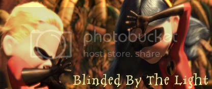

I love it Hannahmation. Really clever, though I am not really familiar with a lot of Bruce Springsteen. Still, I love the pictures.
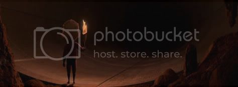
Just looked through all your previously posted graphics, and they’re a really fantastic variety, Hannahmation! I love the “Charge!” one with M-O, the Toy Story avvies and siggys, the ABL ones with Atta and Dot, and the Up one with “I’m blind!” And your TI siggys look real neat, especially the one with Dash and the torch in the cave. (And I noticed that Vi’s standing like a table in the “Family Affair” one ![]() )
)
Hannahmation - Thank you very much for that insightful information! I’ll attempt to put your methods to good use when I play around with the Photoshop program. ![]()
Cool “Incredibles” graphics, by the way! I particularly like the first two signatures.
– Mitch
That “blinded by the light” one is genius and very funny. ![]() It makes me think of that song… And it’s cool how you posted two signatures with text and the last one is all blank. Kinda lets the last image speak for itself, in a way.
It makes me think of that song… And it’s cool how you posted two signatures with text and the last one is all blank. Kinda lets the last image speak for itself, in a way.
Thanks for the kind words, TSS, BDD, Mitch, and rachelcakes1985!
And you are welcome for the info, Mitch. Happy to help. ![]()
Ooh, Incredibles sigs!
Which scene was the “Blinded by the Light” sig from? If my memory serves me right, is it the one where the family is reunited in the jungle clearing?
“It’s a Family Affair” has to be my favourite because it’s super-wide and the tagline is witty!
The last one evokes a sense of creepiness. Great screencap!
What fonts did you use for the first two? ![]()
Nice The Incredible sigs, Hannahmation! I like the middle one, as the shot suits the caption perfectly, and the last one is very creepy and ominous. I want to move Dash out of the way of the tunnel in case anything comes out of it. ![]()
TDIT: You are right about the scene used for ‘Blind By the Light’. I used a Harry Potter font I had downloaded for the 1st and the second is Lithos Pro. ![]()
lizardgirl: Thanks! ![]()
Hannahmation: You are welcome. I can’t wait to see more from you, hopefully more Incredibles ones.
Time for an update!
