All I can say is
what an excellent job you did. I bet any Cars fan would love to put these as posters in their own room. Excellent
job.
Mitch
#123
[quote="JV IS TIZ!!!
PIXAR"]
Here you go Mitch:
 [img:b47
def2dd9]http://i107.photobucket.com/albums/m320/TIZ_00/Ratatouillesig7.jpg[/img]
[/quote]
n
I love 'em, JV! And all of your other posters are incredible, as well, especially the
Cars posters. Keep up the great work!! 
I just noticed the Ratatouille one JV. Marvelous work on that too. Sorry I didn’t catch that earlier.
[b]TSS and Mitch:
Thanks alot guys! very happy  [/b]
[/b]
What are you going to do next?
Mitch
#127
JV - You are most welcome!

And yes – what challenge shall you conquer next?
[b]TSS: I don’t really know. I guess what ever mood i’m feeling at the time. 
[/b]
[b]TSS: Sure, but it’s geting kinda hard
to find more Incredibles pictures to do.[/b]
Cool Cars posters JV! I really like that Lightning one.
Mitch
#134
Let’s
see:
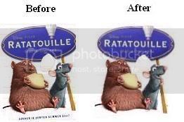
1. The picture was tilted, but was then straightened/put upright.
2. - The small writing at the bottom of the “before” poster was
removed.
I like the “after” one. However, I am still trying to figure out what those words
are/say in the first version. Hmm…
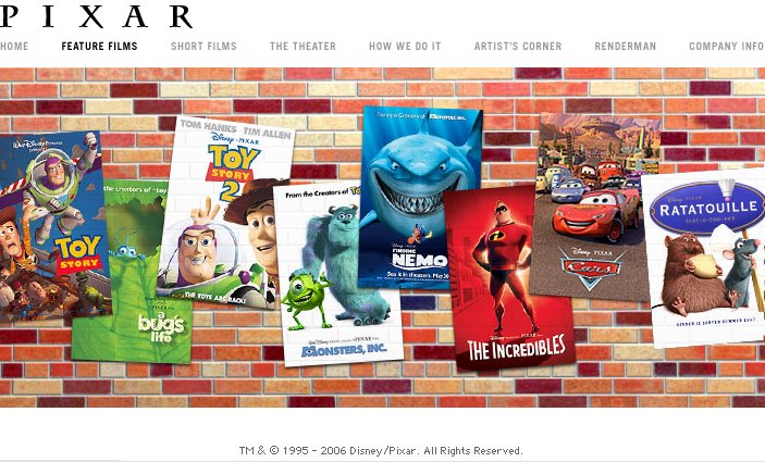
[b]Mitch: This where I got the poster in the first place:
nI removed the words on the ?after? poster because I could not read what it said. I also straightened the
“after” poster up.[/b]
Not really. Could you please explain it to me? I must be blind. 
[b]TSS: Here’s what Mitch
noticed:[/b]
[b]I straightened the poster up and took off the small writing at
the bottom of the “before” poster, because I could not read what it said. On the right side of the
“before” poster you we see that part of the Ratatouille logo is cut off, so I added it on. Can you see
difference now?[/b]
Oh yes. That is much better. Thank you. I can clearly see now.
 [img:b47
