Ugh, the horrible puns. When will they stop!? This movie does not look “pawsome”, and I will not “quack up” whilst watching it. It looks…hairrible…yeah, see what I did there? That there’s a pun. Maybe I should have worked on this mooooovie (are there cows in this movie? Do caribou or moose count as cows? Do they even moo?).
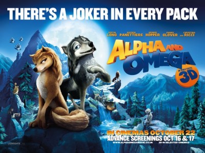
I know it’s a cartoon, and not a big deal, but it bothers me how the chick wolf has long flowing hair and a flower. It’s so lame, and the dude wolf also has a hairdo. I guess it’s for children so they can tell which is the girl and which is the boy, but it still kind of bothers me.
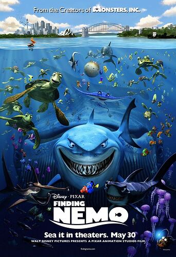
Are you kidding? Hairdos on animated animals are awesome. My main problem with Finding Nemo was the fact that they didn’t have hair. Am I the only one who thought Nemo would have looked super-cute with Justin Beiber hair and a matching hat? Or maybe Dory with “The Rachel” ![]()
The sad part of it is that I actually just pictured that in my mind…
I feel so sorry for Panietierre and Glover. Love both of them - Panietierre’s hot and talented, and Glover’s just awesome, like Morgan Freeman awesome. Shame they’re gonna be in this flop of a movie.
I apologize for giving you such a horrid mental image ellie-jessie-eve. Oh, and just so everyone knows, I was joking about the hair on animated creatures, I don’t actually like it. Sarcasm is kinda hard to convey on the internet, and I don’t want anyone to misunderstand me. Nemo would not look good with Beiber hair ![]()
Chopperface, I wouldn’t worry too much about Glover and Panietierre. Every big star has at least one flop under their belt; Affleck has Gigli, Berry has Catwoman, and Travolta has shudder Battlefield Earth.
I could tell that you were being sarcastic, because you used the rolling eyes emoticon.
You know, this guy-------------> " ![]() "
"
Just looks like a bad rip-off of Newt to me, aw well- let it pass. (I absolutely hate this movie, but am trying to keep as nice an atittude as possible).
For some reason, I really love the new poster compared to the first series. Maybe it’s because Alpha and Omega are together side-by-side and have a nice composition, or maybe it’s because the scenery looks much more spectacular (though, it does copy the recent trend of moonlit posters from this, this, and this movie ![]() ).
).
And the hilarious tagline (Sorry, I’m a sucker for puns). And the ‘Dark Knight’ style list of credits at the top (Dennis and Danny in the same movie? These fogies rule!).
Of course, this is just my good vibes from the poster (I’m not being sarcastic).
Maybe the actual movie will be all bark and no bite. Haha, doggone it, someone needs to put a muzzle on my lame howlers, huh? (Okay, that last sentence was being sarcastic)
Like I said, it’s a real shame that the talented artists in Lionsgate and Crest have to work with such a horrible script written by hacks in Hollywood.
Lol, those three birds in the upper left corner are copy-and-paste.
Ahaha, you’re right! ![]()

Just…stop. Please. Couldn’t Dennis Hopper have lived a bit longer so the last film he worked on wasn’t this crap?
“There’s a joker in every pack”
Ugh, they came up with even more lame taglines?
And the copy-and-paste birds are still there. ![]()
And I don’t think a movie has to rely on 3D to be awesome. Heck, it can take away from the experience, even…
I mean, they’re advertising it like the 3D is part of the title… D:
It also says, “In paw-some 3D.” SHOOT ME NOW!
Seriously, these taglines are making “She’s been grounded, like, FOREVER” look like intelligent marketing.
Seriously, these taglines are making “She’s been grounded, like, FOREVER” look like intelligent marketing.
![]() I agree! Man, I hate corny taglines!
I agree! Man, I hate corny taglines!
The first time I saw this trailer was when I went to see Despicable Me and my first thought was Why do they have a trailer for a video game? Then I realized that it wasn’t a video game, but an actual movie (for some reason, I had assumed that it was like, PS3 graphics or something). ![]()
Needless to say… I cringed throughout the entire trailer. I just… I don’t even know. ![]()
Daughter of Eve: You are so totally right, that’s what the animation reminded me of too, a video game!
Hey, I liked that! At least they made an effort at wordplay, unlike Tangled’s fail-attempt at ‘teen-speak’.
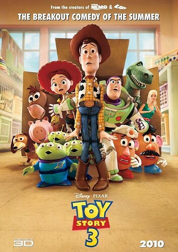
It’s not like Pixar is immune to none-too-subtle puns either:
And that poster doesn’t look too bad, remove the words and I wouldn’t mind pinning that up on my wall. The image alone looks amazing.
Although as I’ve mentioned earlier, it is drawing upon the current trend of ‘characters under a beautiful moonlit sky’ which has been done before by Wall-E, How to Train Your Dragon and Despicable Me. And those copy-and-paste birds, ugh…
Give paws for thought?
TDIT: “There’s a Joker in Every Pack”
I missed that one! That one’s actually pretty clever, and I agree it’s better than Disney trying to speak teen.
Glad you share my sentiments, ellie-jessie-eve! ![]()
Alpha & Omega Trailer ~ Balto Style!
The similarities are uncanny…
ALPHA and OMEGA Music Video [1080p HD]
And this MV by a great Youtuber I know called AlphaWolfKodi looks like an official music video!

