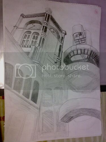
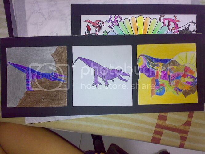
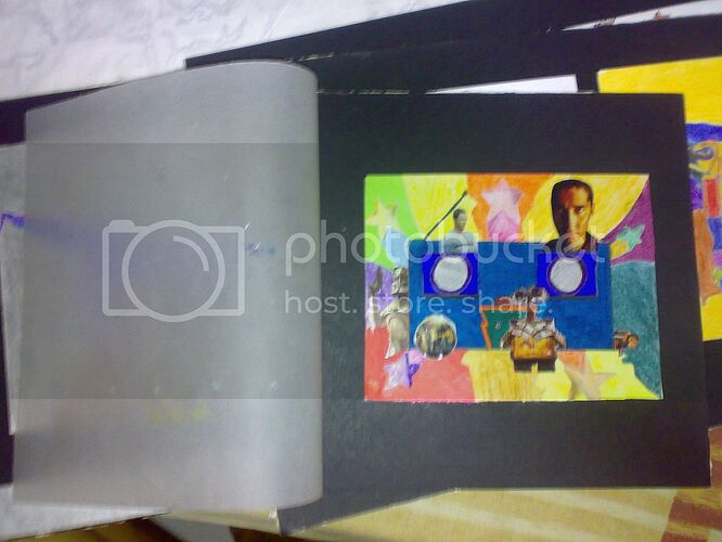
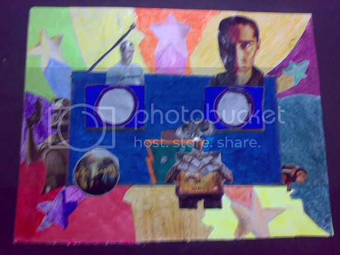
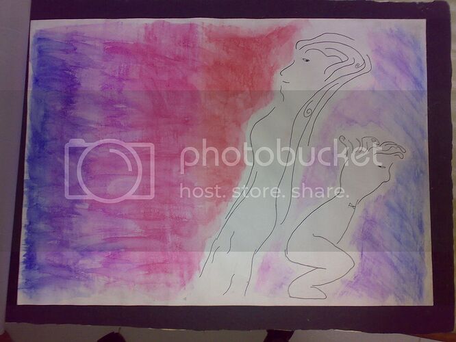
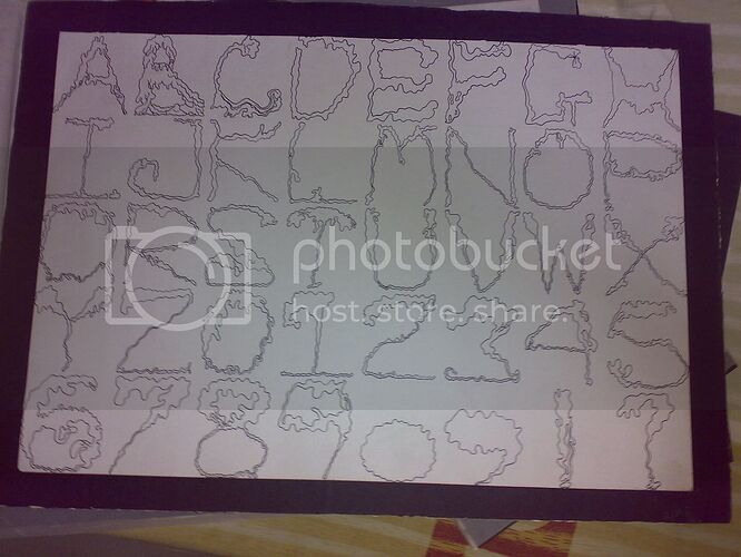
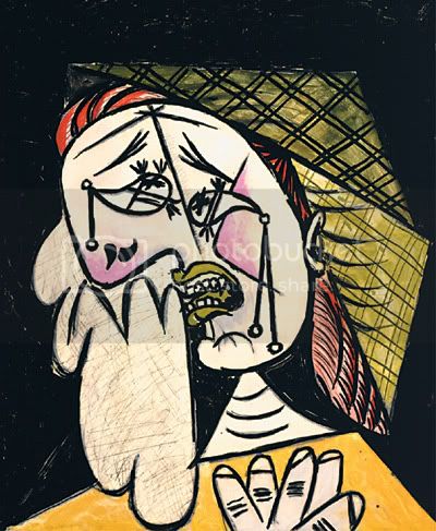
These are the artwork I have done in my college since January for the Digital Media Design (Digital Video Effects) course. We were told that drawing these are the fundamentals to get a hold of the design principles and help us become better designers when we have to work with creating original videos in the following year. I personally dislike drawing, so, naturally, my artwork ain’t of the best quality. Nevertheless, I feel appropriate that these should be shared with you guys. They might be a little off in quality, but they aren’t that bad, yet.
In Miss Lulu’s Drawing Techniques class
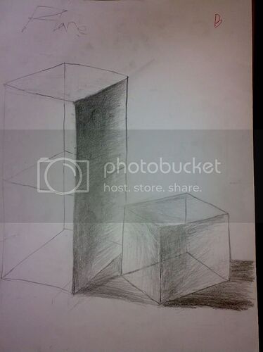
After drawing some contour lines, practicing drawing squares and cubes using dots and lines as described in this thread, we moved on to drawing bigger cubes with 3-dimensional transparency with added shadowing.
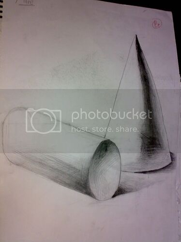
Then we moved on to cones and cylinders.
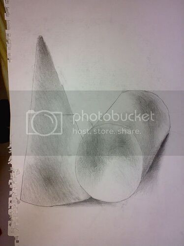
More cones and cylinders.
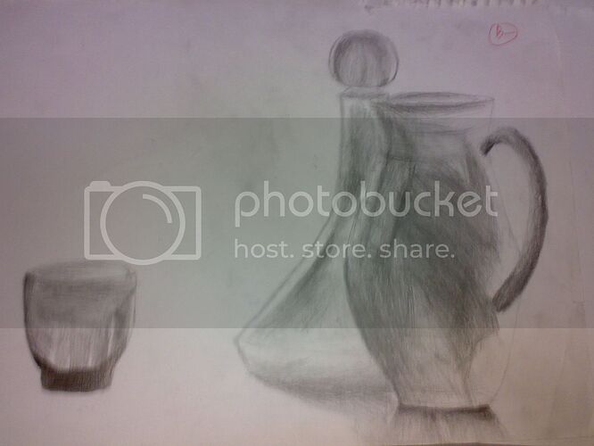
Then, we were asked to draw the refraction of glass. The object behind the jar was a large pawn chess piece, actually, made out of glass. It was definitely an increase in difficulty, but I managed to pull it off somehow.
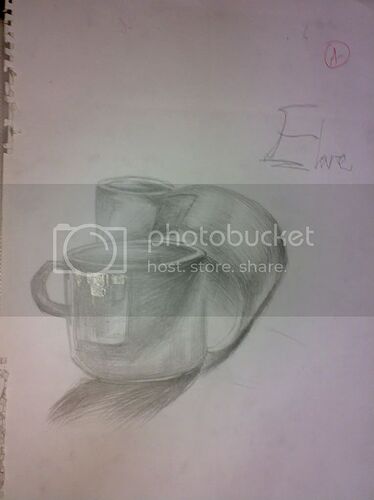
Next, we move on to ceramic cups. These were fun to draw because a lot of us had a lot of trouble drawing out the label across the cups and the situation ended up becoming a little humorous.
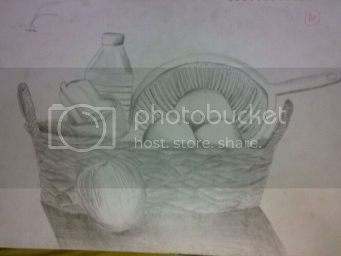
This one was a bit of a toughie. We were kinda taken aback when we first saw this. The weaving pattern was the toughest to draw, especially with the ever changing style of the pattern across the basket. I think the best feature about this one is probably the cloth in the cup. I really like how I draw the shadows in its wrinkled texture. Shadowing is a lot of fun. It’s easy and it’s really cool-looking if you do it right and make the characters/objects look alive/realistic.
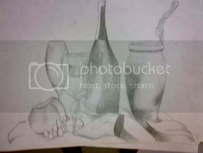
This again was one of the easier works. I’m particularly proud of the wine bottle’s refraction. I know the base of the cup by the wine bottle looks distorted, but I remember the based to be like that, but I’m unsure.
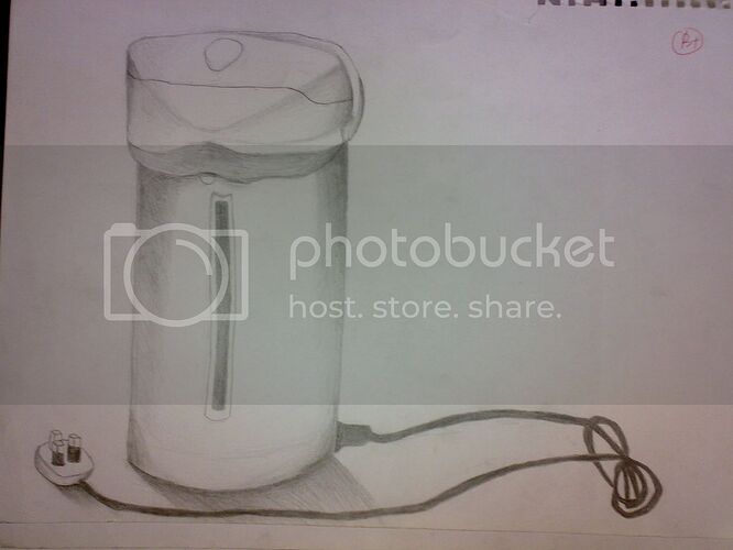
Another easy peasey assignment. Only the wire dangling out and its knot annoyed me.
Then, the first real challenge hit me - landscape drawing. I had a lot of assignments in this field in the class, but most of them were left partially done or have never even been touched upon at all. This is the only completed one that I could find.
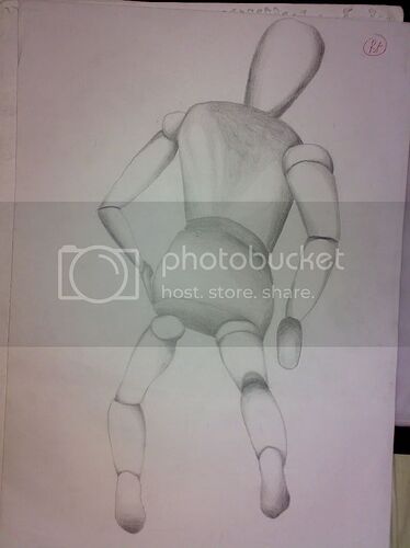
Then, we moved on to drawing human structures. We had to draw these… er, human dummies, whatever they are called (there was a specific term for this, which I forgot, constantly). It was quite fun and quite easy, too, compared to what was coming up next…
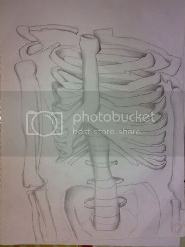
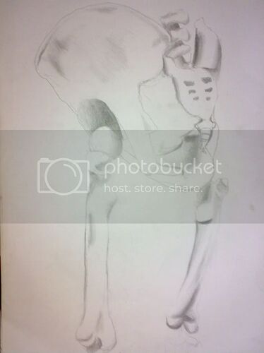
Next: Human bone structures. It was a little intimidating. But this is still not the worse yet; at least it was still doable. But er, heh, I didn’t finish the skull for this set, so I’m only left with the ribcage and the pelvis.
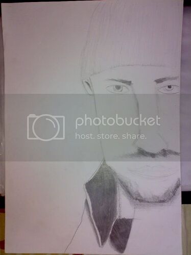
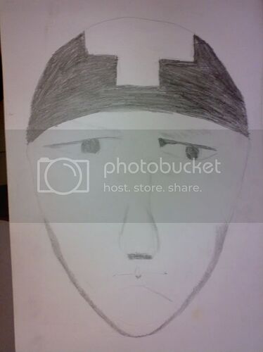
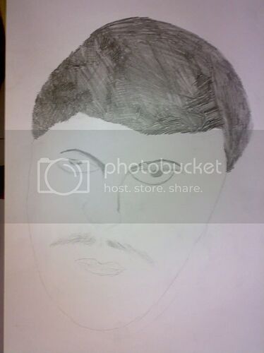
Finally, the worse of the worse: Human Portrait. I totally sucked at it.
This was supposed to be Daniel Powter:
This was supposed to be Ryan McCombs of Drowning Pool:
And this was supposed to be Sean Kingston. whose find mustache I tried to portray poorly:
His fine hair was a difficult factor, too.
Sigh. With those disasters done with, let’s move on to…
In Miss Wendy’s Principles of Design class
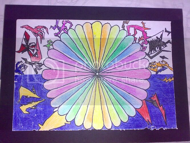
The first month had us working on brainstorming and mind maps. Soon, we were asked to work on bigger assignments that had require us to mount our artwork on mounting boards - black ones - for our work to have a look of professionalism.
Because i’m kinda caught up with something at the moment, I’m just going to post my artwork and i’ll try and describe each of them later on. Hope you enjoy them.
I’ll come back and talk about them later. ![]() Till then, please comment on them, whether if you like them or not.
Till then, please comment on them, whether if you like them or not. ![]()
~ Flare
