As someone who’s drawn EVE, I can totally relate to that! She really isnt as easy to draw as she looks. Everything is on her basic shape and the shading because she doesnt have much else. She’s like drawing an egg, and drawing eggs can be very difficult.
Nicely done, Halos Nach Tariff! You have some good shading skills!
I think you should do both! The Wall E one first so you can continue to work with the same characters for a bit. I always like working with on subject for awhile and then switching it up. And besides, I’d like to see you work with color. ![]()
Halos Nach Tariff - The final result looks wonderful! All of your hard work and effort paid off. ![]()
As for what type of composition you should work on next, I’m with Hannahmation on this: I think that you should do both. I would also like to see you tackle the WALL-E one first, but it’s ultimately up to you!
– Mitch
I agree with hannahmation nd Mitch as well. I suggest you try both.
Thank you everyone, guess I’ll be doing both then! I’ll do the Wall•e one first as I haven’t worked in colour for a loooong time so I’m interested in seeing if I can still do it…
06/03/09 • Okay, here is the first draft of my latest piece, taken from the Wall•e credits:

11/03/09 • Sorry about the delay, I don’t get much time to draw at the moment. Anyway, here is the next stage of my ‘Down to Earth’ picture:

I’ve added colour to all areas of the picture and am now working on deepening the colours and shades so they stand out more. Unfortunately my scanner does not pick up colours all that well so the real picture is actually somewhat darker than this. There’s a lot of detail that you can’t really see on the scan, such as on the sea and the mountains. I’ll see what I can do to fix it, someone I know has to have a better scanner somewhere…
Again comments. suggestions and criticisms are welcome.
• 15/3/09
Unfortunately as of yet I have been unable to locate a decent scanner. I have also discovered that my coloured pencils are way too soft to achieve the kind of contrast I want. So I have attempted to alter the colour of my picture on my computer:

Unfortunately I think that this is the first time ever that I have used a computer for art…
Basically this is the same as the previous picture but I’ve changed the saturation to make it darker. I’ve also added the lyrics to Down to Earth down the side, these are too small at the moment however.
All in all things are not going too well…
I love the scene that you’ve chosen, Halos Nach Tariff. Once again, WALL-E looks very detailed and EVE’s proportions are good. The colouring, I think, looks better on the unsaturated one as it looks more natural, though I know what you mean about the lack of contrast- it’s so difficult to get good contrast with colouring pencils. A bit more layering of the colours might help deepen them, but to get a lot of contrast takes a lot of time especially with a big scene like the one you’ve drawn. Cool idea to add the lyrics to the piece, too! What song did you choose?
Thank you, you’re right about the colours I think, it’s just that my scanner cannot pick up on all the shades on my picture. Oh well back to layering…
The song lyrics are from ‘Down to Earth’. Although I had to cut some of the end of to make it fit.
Dude, it looks so beautiful. One could cut it out and hang it on his or her wall or something. It looks so classic and wonderful.
Nice! Even though the unsaturated one looks more natural as lizardgirl pointed out, I really enjoy how you altered the colors with the computer. They really pop and give your piece something extra. I am also a fan of showing your mark making. And as lizardgirl also pointed out, more layering should help with the contrast, but depending on the type of color pencil it may not. But I do think using more layers of color would bring this piece to the next level.
Keep up the good work! ![]()
Nice drawings Halos Nach Tarrif! the colors are so nicely done, it makes the picture so beautiful. I’d agree with TSS, you could easily hang that somewhere in your house.
Halos Nach Tariff- Don’t get me started on scanners! They never make a picture look as good as it does in real life, it’s so annoying. And that’s cool, should’ve realised that the song lyrics were from Down To Earth.
Thank you for your kind words everyone, I shall now proceed to add more layers…
It seems that my coloured pencils are very soft and it makes shading difficult, oh well.
In the meantime I’ll keep playing with it on my computer and see what this computer program can do. I haven’t really used it before, and I’m not good with computers, so it could take a while…
Hah, the number of pictures I’ve intended to hang up but never have! I actually have some frames now though, so maybe this time!
Halos Nach Tariff - Nice work so far! Although I do like the feel of the unsaturated one, as others have stated, the updated version of the piece (with all of the bright colors) catches one’s eye and makes the image stand out. The Down to Earth lyrics look nice on the side of the drawing, as well.
Keep up the good work! I look forward to seeing the finished piece. ![]()
– Mitch
Wow, marvelously lovely work there, Halos Nach Tariff! Great job! You must have been real patient and dedicated to finish your Define Dancing scene there- your hard work shows! And as for your “Down to Earth” piece, it’s really wonderful artwork. It looks especially splendid with the coloring.
Wow, why didn’t I see this earlier?
I love your Define Dancing drawing best! I love how you added little details like the rivets on the ion flares’ panels, or the BNL label on the fire extinguisher. The shading is impeccable too! I agree with the rest it would look better without outlines, but other than that, it’s one of the best B&W pieces I’ve seen on the forum!
The Down to Earth drawing is pretty good too, though IMO it’s less detailed. Eve also looks longer and more odd-shaped than in the Define Dancing drawing, so maybe you can fix that a little. I like the magenta sky and the scenery, it’s quite nice. I also liked how you incorporated the Down to Earth lyrics running down the side, I squinted and made out the lyrics before you mentioned it a few posts down. It’s good that you’re learning post-production editing, nothing like using the computer to tweak the scan a little.
It’s very interesting to see how you develop your artwork in progressive stages. Can’t wait to see the finished product of Down to Earth, and the Ratatouille drawing!
Thank you everyone!
I’m trying to get more detail into the ‘Down to Earth’ piece with my coloured pencils but it’s not going well… I’m also going to see what I can do about EVE, thank you for pointing out that she is too long ‘thedriveintheatre’, I guess I was so busy on the background I forgot to work on the characters.
Anyway I’m going ot start on my Ratatouille piece. I haven’t given up on the Wall•e one but I can’t lug my box of coloured pencils to college everyday whereas I can take my normal pencils. I should have a preliminary sketch done for tomorrow or Thursday.
I can’t wait to see it Halos Nach Tariff
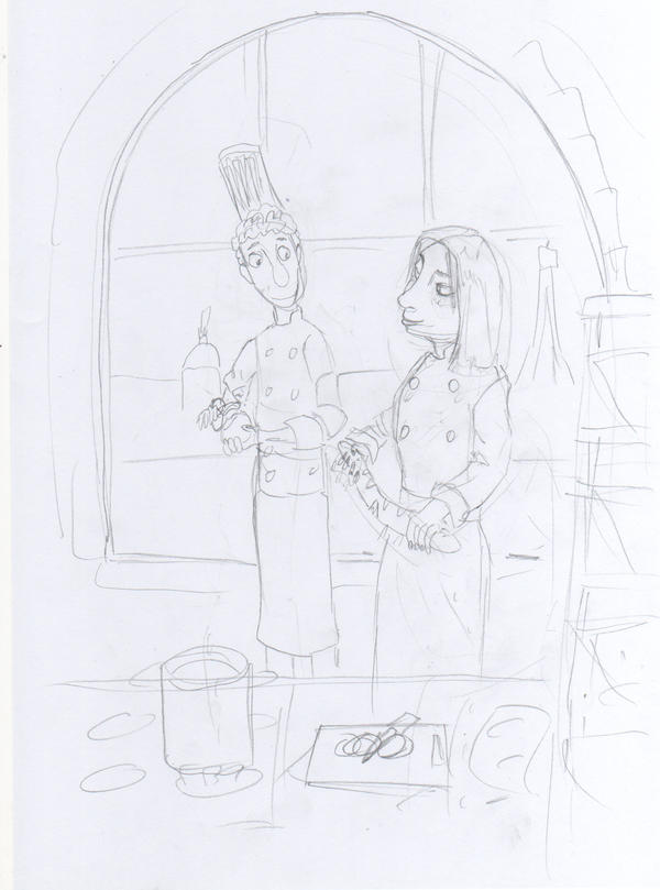
• 18/03/09
Okay here is the super-rough draft sketch for my Ratatouille piece:
fc14.deviantart.com/fs42/i/2009/ … tariff.jpg
As you can see it’s just a very simple line sketch at the moment. That vague thing to the right is going to be a rack of bread baskets and the thing at the bottom is going to be a worktop with various chopping boards, pots and ingredients on. It’s not a direct film to paper drawing because my DVD won’t play on my laptop and I can’t be bothered pausing it on the TV. If you wondering why Linguini is peeling a potato it’s because when I had his hands doing nothing it looked kinda weird. The background out of the window is going to be a stylised view of La Ville-Lumière.
Tell me what you think.
I say it looks pretty good. There is clearly a strong, loving relationship between the two. You did a good job drawing the two prepare food. NIce work. Keep it up.