are these any good?
- yes
- no
- they’re alright
0 voters
I know these aren’t very good, but I thought I’d give it a shot.
are these any good?
0 voters
I know these aren’t very good, but I thought I’d give it a shot.


I really like it mo. These are original and really nicely done.
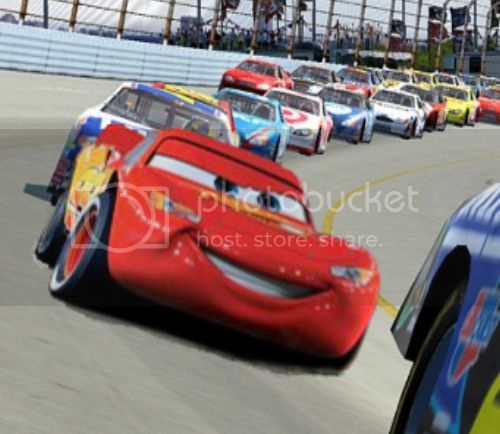
Nice! Some of the edits made me giggle. If you’re looking for critique, though, make sure you have nice, high quality caps for your graphics. The first one is quite pixely.
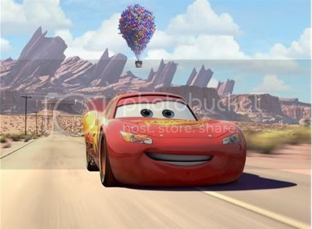
I love your ideas, mo! Some of those are pretty funny. The one with Lightning and Carl’s house floating behind him looks really convincing and the Boundin’ one is sweet.
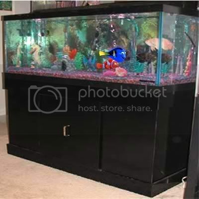
I don’t think there bad at all. Those were actually some of the best graphics on here that I’ve ever seen. Seriously! My favorite one is the one with Lightning Mcqueen driving in the front, and Carl’s house in the back. I also like the one with Marlin and Dory.
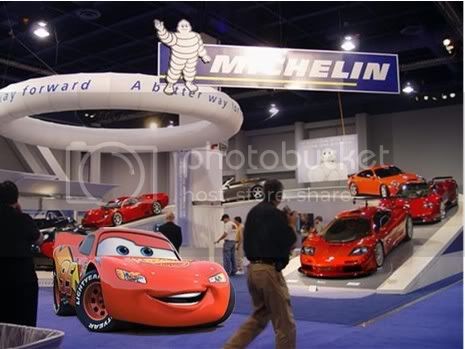
I agree that the first one could have had a sharper resolution to blend in easily. The lighting also looks a bit off in the third one (compare how bright Lightning looks compared to the walking passerby).
But the second and fourth are awesome! I like how Dory and Marlin look like they’re in the dentist tank (reminds me of the Jean-Michel Costeau live-action/animated documentary on the Finding Nemo DVD). Maybe adding a reflective glass layer would have made them look like they were in the tank, but I’m just nitpicking.
The fourth is the best! Maybe it’s the way how the blue sky with fluffy clouds in the original Cars pic looks like the one in Up, but it looks mighty convincing to me! I liked that one, very nice! ![]()
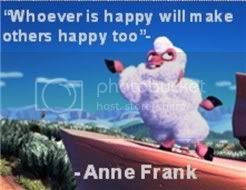
Oh, and the Boundin’/Anne Frank quote would make a fantastic sig!
mo: These are really cute for a first time! ![]() Like some others have already said, it is a wise idea to either get higher-quality images to make graphics with, either that or resize them when you’re finished.
Like some others have already said, it is a wise idea to either get higher-quality images to make graphics with, either that or resize them when you’re finished.
Oh my goodness, I absolutely love the Anne Frank one. <3 You should really make that a siggy, mo! ![]() The Up/Cars crossover one is so cute and clever, and it blends so nicely as well.
The Up/Cars crossover one is so cute and clever, and it blends so nicely as well. ![]() Keep it up mo, you’ve got a pretty good start! It always takes lots of practice to get better and better, so don’t give up!
Keep it up mo, you’ve got a pretty good start! It always takes lots of practice to get better and better, so don’t give up!
little chef
I finished this last week, but I just got around to posting.
Anybody a fan of Subway’s $5 footlongs? ![]()
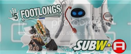
Dude, that is really clever and funny.
They look pretty good. I like how in the Up/Cars one, Lightning looks like he’s having a good day, and the house with balloons is flying by. It also looks like a little colorful lightbulb, as if he just had a great idea.
The Boundin’ one is so cute!
And your most current one, the Subway ad, looks cool. I like how you thought it up and put it together…it’s brilliant.
Mmm, I love Subway! And your newest signature is clever, especially considering the look on EVE’s face, like ‘woah…’ ![]() Nice work!
Nice work!
mo - Puh-ha!! The Subway one is great. Nice mash-up. ![]()
– Mitch
It’s been a while hasn’t it?
I took a picture of Eve and just did a few things with it on photobucket. They’re alright. Tell me what you think!

And I just thought this looked awsome.
Enjoy! ![]()
Wow, that does look so awesome.
Hey mo! These are amazing!
I especially love the ones with Lightning McQueen, and the Subway sig! They’re so cool! You should make some more sometime!
BTW, are these done with Photoshop?
This one made me LOL. xD
Hey Everybody! Thank you all so much for commenting on my stuff! I really had fun making these! It’s nice to know people like them! And btw, the Subway one is my personal fave also. ![]()
JustSoWall-eCrazy, actually, no, these weren’t made in Photoshop. Here’s how it worked, I used to post on here with my PSP cuz I didn’t have a computer I could use to post, but we did have this old computer that didn’t have internet, but it had this software called PictureThis! and that’s what I used to make all of these (except the 2 new ones, those I just ran through Photobucket, I didn’t really try on those ones ![]() ) but yeah, then I got my Macbook in June and we got rid of the old computer, so now I don’t have a way to make these anymore. I want Photoshop, I used it in my Web Design class at school, and I really liked it, but it’s like 80 bucks or something like that, and I have no money cuz I don’t have a job. So yeah, I wish I could make more of these, but I don’t have a way to do it, which is too bad cuz I had some ideas too!
) but yeah, then I got my Macbook in June and we got rid of the old computer, so now I don’t have a way to make these anymore. I want Photoshop, I used it in my Web Design class at school, and I really liked it, but it’s like 80 bucks or something like that, and I have no money cuz I don’t have a job. So yeah, I wish I could make more of these, but I don’t have a way to do it, which is too bad cuz I had some ideas too! ![]() But yeah, I wouldn’t expect much from me for a while.
But yeah, I wouldn’t expect much from me for a while.
But yeah, Thanks again everybody!
This one is my favorite!
Oh my god. I completely thought your very first image was straight from Cars. Then I noticed the others cars besides Lightning were real! Great job! You had me totally convinced.
I also really liked Carl’s house and Lightning. It looked so smooth!