My Pixar Renders

Im going to go ahead and dip into my archives. most of these I’m not proud of, and the models no longer exist, but just for kicks, here’s some of my really old stuff.

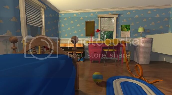
this is a house loosely based on Andy’s.

I was unable to find my rough slinky dog and woody, unfortunately.

That’s a shame. It is a competitive industry, so I can see why he had difficulty acquiring a position in that field. It’s great that you have a resilient attitude despite the prospect that obstacles may bear your path, though.

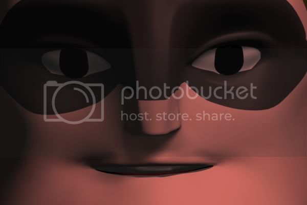
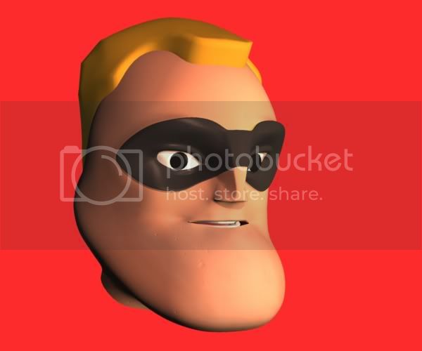
Hamm looks great, by the way – the likeness between your model and Pixar’s character is uncanny. Your interpretations of Bob Parr aren’t too shabby either for just starting out, and the house is awesome! I particularly love the perspective of the last composition.

– Mitch

Not a bad job with Bob. he looks pretty good. Keep it up. I can’t wait to see more.

Long time since Ive updated. the roadblock has been that Ive been wanting to redo the siding because I noticed it sticks out too far from the wall. and because of how tedious it is, I just havnt touched the project in a while. but Here’s a fresh render.


img.photobucket.com/albums/v177/ … emolly.jpg

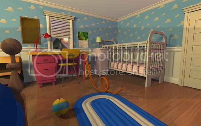
Decided to work on Molly’s things. That means the…I think its a baby diaper holder thing? dont know what its called, but that pinkish thing to the right of the desk, it was just a recangle, and now I’m actually modeling it. its almost done, when it is I think the crib will be next.

oh, and the lamp of course. still need to give it a proper texture. and Im not too pleased with the diaper thing’s texture, it was just a quickie I did in photoshop using a pattern. its not too accurate so I’ll probably end up redoing that one.

still putting off the windows, but I have made the placeholders look nicer.

Also, with the new “Toy Story Collection” toy line I think once I buy these I’ll have a great source of reference to actually tackle modeling the main cast, which I wasnt really planning to do before. So that should be cool. but a real challange to do right, no doubt.

Wow, Kyle! That looks amazing! Your attention to detail is great; making it look like an exact replica of Andy’s room. It’s been really neat seeing your progress as you work on it. There’s something funny going on in the corner of the room, but other than that, it looks great!!

And good luck modeling the main cast! It’ll be a challenge, but I think you can handle it!

Yeah, I’m not sure what’s going on with the corner, but I’m sure I’ll figure it out. Could be a bug, or something blocking a light source in an odd way.

Wow, that’s some really amazing rendering, how long has this project been going on for?

I think Ive been on this for about 2 or 3 years, Im kinda fuzzy on when I started though. but this is actually my second attempt at doing this. I never made it nearly this far though, it pretty much stopped at the floor and wallpaper, and a crappy version of Woody with no hands. the only thing that looked decent was his hat.

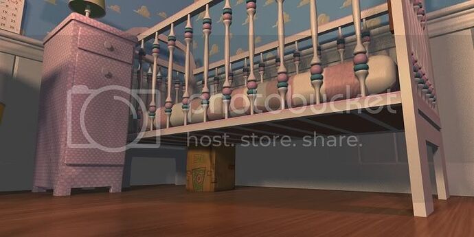
But anyway, here’s a peak at Molly’s crib I started. I’ll be redoing the end pieces, their too innacurate.

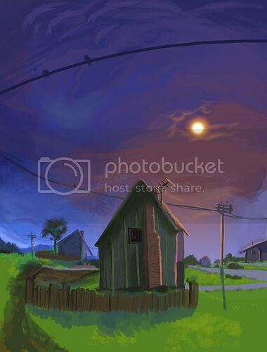
you might also notice a new scene outside. instead of a temporary backdrop, I did a painting in photoshop of Sid’s house. Which I’ll go ahead and just post here so you can see the whole thing.

Your latest render is great, Kyle! Molly’s crib looks really good, and I love the idea of actually digitally painting the scene outside the window. It’s the little details like that that add up to making your render look just like Andy’s room.

Thanks, as always.


img.photobucket.com/albums/v177/ … tobank.jpg
(remember to either drag these pics to the address bar or click the links I give to see the full size, its hard to see certain details unless you do)

I’m kinda confused about the scale of certain things. for example, this new box I added appears too small, but the crib seems just right, but I cant make the box much bigger or it wont fit under the crib. so something is off in size, I’m just sure what.

Anyway, I figured out the weird shadow problem in the left corner you guys saw earlier. I mean, I still don’t know what the cause is, it must be a bug because the only light from that light should have been the one cast on the floor from the one open window, not randomly on the edge of the floor and wall like that.

But I did make it go away by narrowing the focus of the light down a bit, so its only as wide as it needs to be to shine in from the window.

:open_mouth: DAAAYYUUM Kyle that is A-freakin-mazing man!

Nice work as always! The only critizim i can give it is that the props and elements look a bit too big but NIIIIICEEE WOOOOK! :bulb: :open_mouth: :smiley:

Could you be more specific? which props/elements? is it really the props, or does the room itself seem a bit small? Do I need to make the ceiling higher up?

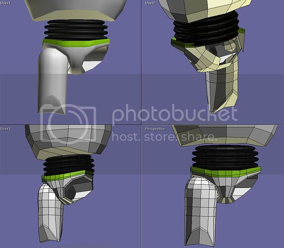
Anyway, taking a break from the unfinished crib, Ive started on Buzz, but I don’t have anything worth showing yet. its really hard because he has a lot of round shapes. and I’m only on the pelvis/legs, so I have a lot more ahead of me.

Excellent work so far, I imagine this could be rather difficult to get down pat, but you’ve done a fantastic job thus far. I plan on going into this sort of thing down the line, more likely animation though. Any tips or ideas about how I could get started in 3D graphics? You seem rather experienced to get this sort of quality, so I hope you don’t mind me asking.

I can’t wait to see how this grows! Stick with it!

All I can really say is pick a program, and do as many tutorials as you can. Your first ones will just be building simple things like a teddy bear, or egg plants, to help you get a feel for the interface. Gradually you’ll pick up things like using proper edge loops and whatnot. That’s still something that confuses me to this day.

I may have been doing this for over 6 years now, but I still don’t feel that experienced. if I were I’d have done my own short by now. The most I do, animation wise are simple tests. If you’d like to see how primitive my animation looks, you can check out some of my videos. this is a reel I put together.
(this one had music, but youtube muted it due to copyright infingment)
youtube.com/watch?v=uM29IH7N2yE
Oh hey! I just remembered you can see one of my older attempts at modeling Andy’s room here. So crapy compared to what I have now. haha

youtube.com/watch?v=tYDP0PVATWc

youtube.com/watch?v=ZL7a8boDbxM

anyway, one important thing is to not be like me and get too stuck in your ways by only using one program. Ive been using Anim8or all these years. I love it, it was great to learn on, and it does continue to get better with each new release, but it’ll never compare to programs like 3ds max and maya for the simple fact that Anim8or is made by one guy. 3ds max and the like has an expansive team of developers. If all possible I’d suggest starting with a high end program like that.

For me, I just dont have the patience to learn a new program. I feel like I’m starting from square one, even though its really just a matter of a new interface and being out of your comfort zone for a while, unlearning what youve learned.

that being said, if you just want to jump in I’d say anim8or is the easist one to learn, due to its minimal design. it doesn’t show you a million buttons you wont ever need, nor does it require keyboard shortcuts. (but it does feature them)
it makes sure that any button you dont need or cant use is out of sight, which I find really speeds up the learning process. other programs give you everything at once. its an information overload.

but Im kinda rambling here.

one last thing though, anim8or is, ironicly not very good for animation. its good for modeling and to an extent, rendering if you have the patience, as its horribly slow, but it lacks basic animation tools like IK, which makes it easer to pose your characters.

For animation you probably want maya.

Hopping to show you guys what I have of Buzz tomorrow. be warned thoughj, its not too pretty.
Hey Kyle, I meant that your crib is WAY too big, but it’s very accurate to the movie. Did you see my renders in my render thread? Go check it out when you get a second…

Thanks for the tips. I currently have Cinema 4D, but I haven’t really messed with it too much yet. A few friends of mine know it fairly well, so I plan on having them show me the ropes, hopefully I’ll get something substantial done at some point and post it on here.

Thanks again!

I agree that it looks too big, but Im not sure why. in fact mine still isn’t as big as it looks in the movie. the tops of the end peices go up further past the side panels on the walls. as for the width, it seems to be about right, based on the amount of space between the door and the crib.

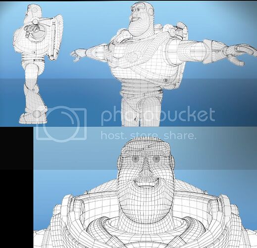
Wasnt going to post this so early but what the hey, I havnt updated in a while, might as well.

thanks to John Lasetters latest video I now have some good reference.

Plus I got the toy itself, so that’s good. still going to be really hard to get mine close to that.

Good Buzz model… I see you have good modeling practices… no triangles, all four-sided tessellation. I’m impressed. If I can model half as good as you, I’d be a happy man. :slight_smile:

Starting to look legit!!