NEW! 'Circus Afro' - The Art of TDIT

Hello everybody!

I am proud to announce the debut of my new DeviantArt journey with my first personal artpiece in years! Yes, believe it or not, I’m in a digital arts course, but all of the work I’ve done is mainly school or assignment-related, so this is the first time in a long, long while I’ve actually indulged my own interests. To be honest, I actuallly set this account up last year, but I’ve done nothing with it, and seeing it’s my final year at uni, I figured: It’s now or never to gain some constructive criticism online before I enter the big bad real world!

So to get things started, I have created a self-portait over the course of two weekends. See how much of my personality and passions you can discern from the montage:
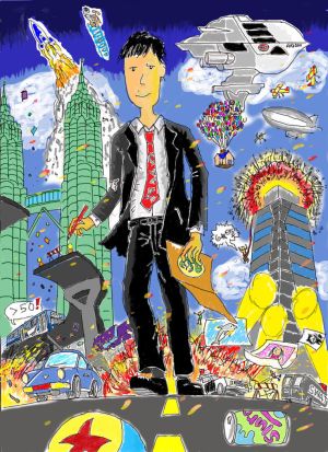
Yes, I’m really that skinny and lanky in real-life. Yes, I have a mole above my lip to the right, and a pathetic haircut. Yes, I do own a suit, minus the tears and the Luxo tie. No, I don’t swagger around in the streets like J.B. with random explosions and various movie scenes taking place in the background. It’s a visual depiction of who I am and what I like which is not suppose to make sense literally.

But I’m sure you got all that. BTW, this is the closest you’re gonna get to seeing my mug, so to all those wondering how I look in real-life, this is pretty close. Man, I need to brush up on my caricatures.

Read the dA art description on the thought process and method I used to make this number. Needless to say, this is the last time in a long while I’m gonna use a Wacom to illustrate an entire piece!

Please drop me a comment (here or on dA) and tell me how I can improve. It’s no use giving one-sentence answers like “Nice, I like it”, or “That sucks” cos I won’t take those seriously. I need your honest opinion, so don’t be afraid to criticise, but give an explanation.

Remember, be ruthless but not without reason! (Cool line, huh? I made that up)

So enjoy! I’ll set up another thread for non-Pixar artwork, but I think this qualifies for now, since I’ve added a few Pixar elements for you to pick out! Thank you, and I hope to enjoy this next stage in my artistic development, while giving you a glimpse into another side to my creative endeavours. :smiley:

Oh yeah, and here’s my dA account if you wanna read my artistic background and subscribe!
thedriveintheatre.deviantart.com/
That is a really good piece of artwork TDIT, good to see your talent in art!

That is awesome! You know, since you’re such a hand at making those signatures and videos, I had a hunch that you’d have a good eye for design, but I never knew exactly how good! The shading is amazing, Andre! I was laughing at how cool the picture was and at the references in it, and had fun picking out all of the references together. I’m sorry in advance, but I really am no good at giving constructive criticism wth artwork in this medium. So that’s what you look like, huh? Suave. :sunglasses:

Is that “50 >” a reference to Speed?

Looking forward to your fortnightly submissions. :smiley:

I love your style, thedriveintheatre! It’s cool to be able to see hand drawn artwork from someone that has showed us other forms of artwork like your graphics. Your first piece is awesome, so full of detail and action, and it’s a great introductory piece as it shows us all of the things you’re interested in as well as a pretty cool caricature of yourself! Of course, I love the Pixar references, and the Slurm can is also very inspired- yay for Futurama! As for constructive criticism, I’m pleased that you’re happy for people to critique your pieces though in this case, I really can’t think of any areas where you can improve! It’s just such a full, exciting piece drawn in a very unique style, and I’m looking forward to your future works.

Great work TDIT!

I love the fact that there’s so much going on in the pic. :-D)

I wouldn’t give up on the Wacom so quick though, just because one method didn’t work for you, doesn’t mean another might make miracles…:wink:

Keep up the good work!

:mrgreen:

It looks fabulous, thedriveintheatre! I like how exciting it looks, with so much going on in there. Very eyecathing work. You’re lookin’ good in that picture, too, with an expression that looks prepared for something.

Yes, it’s a very interesting, creative, and true line! I’m impressed both by your work and that made-up line. It’s rather inspiring, too. A good way to put it.

Awesome job tdit!

Love the references to pixar movies in the background!

Wow. What an impressive agglomeration of interests! I love the perspective of the piece, and the innumerable and lively colors and knick-knacks strewn throughout the composition. Not bad! :smiley:

As far as critique goes, your caricatured self seems to be leaning a little bit to the left in the image. In addition, certain parts of your body are out of proportion (e.g., your right arm is smaller than your left). I think that more depth could be added to such objects as the buildings in the background as well – this could be accomplished by rendering/shading in these objects.

On the whole, though, it looks pretty darn cool. I like how you look in real life – almost like an FBI agent or something. Heheh.

Keep up the good work! :wink:

– Mitch

Wow, thank you all so much for your quick and wonderful replies! :astonished:

WillZMarler - Thanks! Anything you think I could work on? :slight_smile:

Rachel - Wow, you do seem to share a lot of my work with your sis! :open_mouth: Maybe she should get an account if she’s a Pixar fan?
I wouldn’t think of myself as suave, I’m actually more of a Linguini/Wall-E klutz who tries to be cool but fails epically. That drawing’s my idealised vision of myself, hur hur.
And yes, “>50” is a reference to Speed, my favourite action movie of all time, cos of the unexpected humour and romance that came with the literally fastest-paced film I’ve ever witnessed. Die Hard is a close second but it loses out because of the absence of the romantic element and change in locale (it’s all within an office building!)
But I digress, thanks for your detailed comments as usual!

lizardgirl - Thanks! Yeah, this was probably the biggest personal art piece I’ve done in like, ever… and my first since secondary school. I’m not kidding, it’s that long! Again, most of the work I’ve done during secondary school was doodles on my textbooks which were thrown away or given to my siblings, and when I entered uni, it was all assignment-based. So this artpiece has been a long time coming! That’s why I’m dying to start practicing as soon as possible!
Sorry, I rambled a bit. Yes, I’ve hidden some neat Pixar references and I’m glad you spotted the Slurm can!
Wow, I’m really that good? No boo-boos? Excellent! :sunglasses: Thank you for reviewing, I’ve subscribed to your dA account, if you don’t mind. :wink:

Pixfan - Well, it won’t be the last time in a long while, so maybe I’ll pick it up again when I feel like it. For my next few, I’m gonna try traditional colour pencils and markers (I just hope the scanner can pick up the shadings and all). Yeah, it’s good to be versatile with different mediums. You can be sure I didn’t buy the Wacom only to use it once! :wink:
Thank you for the compliment!

BDD - Wow, thanks! I look good? I thought I looked like I need laxatives or something… :laughing:
But yeah, I was trying to go for the determined, smug, ready-for-action look, so if that worked for you, I’m very happy!
Yup, that line was directed at you, the viewer! Don’t be afraid to pick my work apart, I’ll never improve if I don’t have a justification for doing so, if you get what I mean. :slight_smile:

HelloDolly114 - Glad you noticed them! :smiley: Anything I can improve on? :wink: Thanks for the kudos!

Mitch - “An impressive agglomeration of interests.” Hmm… Joker mode “I like that!”
Well, with regards to my character leaning to the left and his left arm looking bigger, that was intentional, cos he’s swinging his shoulders to walk forward with his right foot. I drew reference from the Casino Royale and Quantum of Solace posters. If you observe Mr Craig in those shots, the appendages closer to the viewer look bigger (hur, hur :stuck_out_tongue:) and his stance is off-balance since he’s taking a step forward.
I must admit, though, my head is too big (the avatar, not my real one! :slight_smile:) and the face a little too plainly shaded (although you can see I tried a little tonal value, but it didn’t quite work out).
And yes, I wholeheartedly agree with you on rendering the background objects! I got too lazy with the Petronas twin towers and ‘Nakatomi’/Fox Plaza skyscraper, and I’m not proud of that!
Wow, FBI… “I like that!” Thanks for your critique, and comment on the dA channel. Look forward to more Pixar related works in the future! :smiley:

Yeah! Joker quote. :mrgreen:

I understand the basic principle of perspective, but it still looks a bit short to me, for some reason. Hmm. Well, perhaps it’s just me?

Oh, pfff. That just goes to show how much I know. Silly me. Thanks for correcting me! :wink:

Yeah, the head is a bit large, as well – just a tad bit…

But, yes, great work, and you’re welcome! :smiley:

– Mitch

Well, yeah, you’re entitled to criticise, and though I may not agree with you, I still appreciate your comments! Now that you mentioned it, the right forearm (the bit of limb between the elbow and the wrist) looks shorter than my left. You know what, I think that one needs fixing. Yeah, yeah. Thanks for that! :smiley:

thedriveintheatre- No worries! And thanks for watching me, though I don’t actually use that account any more since I got a new one (though I haven’t posted any art on the new one yet- just like you, I haven’t done any art in a long while! :laughing:)

Maybe you could do a montage of the feature films hand-drawn?

Nice piece of art work ya got there, TDIT. :slight_smile: Very detailed. I like how you put so much into the background; but if you ever want most or all of your focus to be on the foreground,(in this case, you) you should try to keep the back ground sweet but simple. :wink:

But I love how you worked all those scenes into this particular piece. I could pick out the house from Up, the Axiom, Wall-E with his trusty fire-extinguisher, the blimp from Cars (maybe), and the jumper from TI (maybe). I also noticed the shot from Speed were the bus has to jump the ramp. That was GREAT! (And Speed was just a freaking awesome movie! :-D) )

Any way, I hope to see more from you soon :slight_smile: .Awesome job,thedriveintheatre!

I am very impressed Andre. You not only got some directing and photoshopping skills, but you got some artistic abilty in you too huh? I love it.

I must say, you are truly a man of many talents :wink:

Heh. No worries. Seriously, I think it’s just me. Besides, I’m no professional, so I can’t fairly judge. But, yeah, the limb between the elbow and the wrist is the short section of the arm that I was talking about. My apologies for not specifying it.

In any case, keep up the great work! :wink:

– Mitch

Maybe, WillZMarler. I’ll see how it goes, thanks for the suggestion!

Good piece of advice, Violet Parr! I thought it was a little cluttered.

That’s John McClane from Die Hard. He’s jumping off Nakatomi Plaza with only a firehose as a bungee cord. :wink:

Totally. :mrgreen:

Well, I used to. Now I’m a little rusty, but I’m sure works better than a little practice! Thanks for the compliment!

Why, thank you, woody.

Oh, but you’re a fellow artistic peer, Mitch. And to me that’s just as valuable as a professional’s. Besides, I appreciate constructive criticisms more than compliments, so thanks for pointing out my flaws.

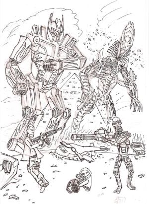
I’m not sure whether to post this here or in the Off-Topic Fanworks section, but since it has an element of Wall-E in it (don’t ask me, he ‘wandered’ into my piece! :stuck_out_tongue:), I’ll just post it here.

Well, I made this back in May, and having watched both Transformers: Revenge of the Fallen and Terminator Salvation, I can safely say they’re both awesome! Slightly disappointing in comparison to their predecessors, but they stand on their own merits.

This is a mash-up pic if a battle ever took place between these two titanic summer blockbusters with a cameo of a pair from another robot movie caught in the middle. I would SO pay to watch such a crossover film if it was ever made!

Anyway, the sketch and inking was done traditionally. I was too scared to mess this up with traditional colouring and too lazy to do it digitally, so I’m leaving it as is, pencil guidelines included. I know, I suck at drawing the feet, ugh!

Compliments and constructive criticisms much appreciated!

War of the Machines

That’s such a cool concept, thedriveintheatre, and you’ve executed it really well! There’s so much detail in that picture, especially with the designs of the machines, and I think this would look absolutely awesome in colour. And I love how you’ve managed to insert WALL-E and EVE in there too. :laughing:

Love in the midst of violence. <img src=“{SMILIES_PATH}/love2.gif” alt=“:loves:” title="In

Love" /> What an interesting concept. The only constructive criticism I can see is that the two larger robots are leaning to the right a bit. I would really love to see this again if you chose to digitally colour it in and repost it here, especially since your shading is quite good, judging by the first piece you posted here. :wink: Your WALL-E and EVE are too cute!