I think it’s obvious which 2 I like best(that he wore, not the extras)!
Here. The words “Spirit·of” are written in the “Disney·Pixar” style:
That one’s nice, too.
Thanks.
That has to be my favorite of your signatures. ![]()
The one from TS3, the last movie released. Love the background.
That is a nice background!
Then my next move was the Pixar logo itself:
This one is really well done, too.
Gotta love your comments, K9Girl 8D
I did the upcoming movies too.
Open this one on a new window to see the larger version:
And one for Brave:
Those are both fantastic! ![]()
Thanks, I’ve got almost all of them uploaded now.
My last Pixar logo, the cancelled movie, Newt ![]() , which was my laziest one. Look at the seams:
, which was my laziest one. Look at the seams:
It’s not that bad. ![]() I didn’t even notice it until I stared at it for a few minutes.
I didn’t even notice it until I stared at it for a few minutes.
Thanks for the support. I was really lazy that day.
But I really liked how the letters turned out in this one. I miss the old Pixar castle ![]()
But I also made the current castle, which is lovely too:
I kinda miss the old castle. And the music. But I really like the new castle, too.
The music is what I miss the most.
My first signature unrelated to Pixar. The embodiment of the Spirit of Adventure itself:
I’ve never seen Indiana Jones, but it still looks cool. ![]()
Oh, you should!
Here’s are two more classics:
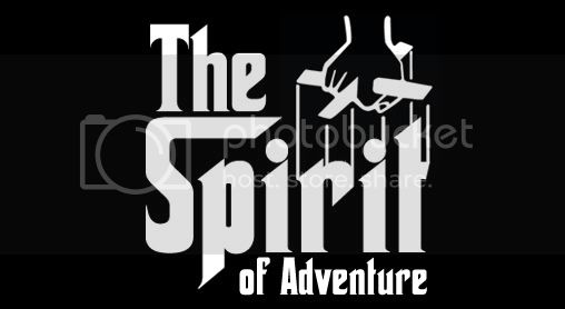
I remember I thought you would eventually do Star Wars. Which I’ve also never seen. ![]()
And it took me forever to figure out your other one…which I’ve also never seen. ![]() But they still look pretty good! I think the Star Wars one turned out very nice.
But they still look pretty good! I think the Star Wars one turned out very nice.
Thanks. The other one is The Godfather, by the way.
The current one:
