It looks great, yet again!
Yeah, I was one of those kids who thoroughly adored Jar Jar when I was little. ![]() I must admit, he still is one of my favorites, but I can agree he has an annoying side as well and I can see why most people wouldn’t like him.
I must admit, he still is one of my favorites, but I can agree he has an annoying side as well and I can see why most people wouldn’t like him. ![]()
Oh, and I like the newest month, especially the warmth of the color palette. ![]()
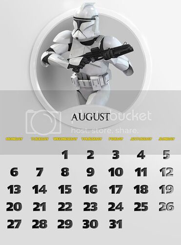
August stands for Attack of the Clones and features the minimalist white scheme of the Clone Army/Kamino.
This one is a real disappointing to me, and there’s not much to say about it.
I think it looks nice. It’s my least favorite so far, but it still looks nice.
Have you ever done the Pixar Planet logo?
Awesome July and August! The Gungan-style you chose for July is just amazing.
And the Clone one for August is just as good!
Thanks.
Now I made the logo from Tommy Hilfiger:
“Signature”:
Avatar:

It looks really good!
This one is slightly better than August, but it’s still my second less favorite.
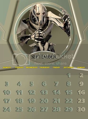
It stands for Revenge of the Sith and the Federation/Separatist army, as opposed to the Clones of last month. It’s represented by General Grievous.
It looks great!
I love your avatar!!
The General Grevious month is pretty cool. Funny thing though, I never realized how many fingers he had until now. ![]()
Yes, he’s that way so he can separate his hands in two identical halves.
The logo from The Truman Show:
“Signature”:
Avatar:
It looks wonderful!
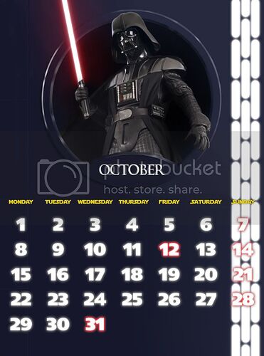
October stands for A New Hope and the Death Star/The Galactic Empire, represented by it’s most iconic figure, Darth Vader.
The effects on the numbers are pretty similar to those of March/The Galactic Republic, as a way to represent it’s corruption and transformation into the Empire.
It looks really great!
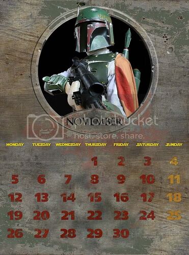
November is for The Empire Strikes Back and Boba Fett, one of the most popular characters in the franchise if nobody knows exactly why.
It looks really good!
Awesome! Boba Fett ftw! ![]()
