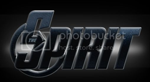
The logo from The Avengers. It deserved a little more work, but I made it on a very emotionally hard day for me, so that’s what I got:
“Signature”:
Avatar:
The logo from The Avengers. It deserved a little more work, but I made it on a very emotionally hard day for me, so that’s what I got:
“Signature”:

Avatar:

I think you did it pretty well, and sorry that you were feeling that way that day.
Great job.
As always, excellent work mate. I continue to be inspired by you, which is more than I can say for myself, these days. ![]() Have you watched Avengers yet, BTW?
Have you watched Avengers yet, BTW?
“Have you watched it today?” would be a more likely question ![]()
Ah, so you watched it today? What did you think? It’s my number one film of the year so far, with The Raid: Redemption a close second.
No, you misunderstand me.
I meant that I’ve watched it so many times, that you should ask if I’ve seen it on a specific day ![]()
I never watch films so late (preferably opening day)
We got an Avenger fan over here! ![]()
So how many, exactly?
Not that many. Four. And I’m not exactly a fan. I liked it a lot, but that’s all.
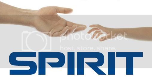
The logo from Nokia:
“Signature”:
Avatar:

Good job.
Great job! You are really great at making graphics.
The logo from Men in Black:
“Signature”:
Avatar:
Good job.
I should clarify that this logo isn’t the one they use in posters and marketing, and only appears in the titles of the actual film.
I thought that. Because I never saw that on posters and things like that.
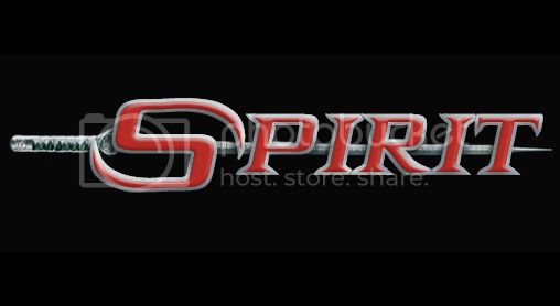
The logo from the terrible film adaptation of the Elektra comics by Marvel. In the original, the “E” forms a sai, but since I had to use a “S”, this looks like a simple stiletto knife ![]()
“Signature”:
Avatar:
Good job, the S does look awkward, but still pretty good.
It looks nice.
Very cool! I especially like the Avengers and Nokia one
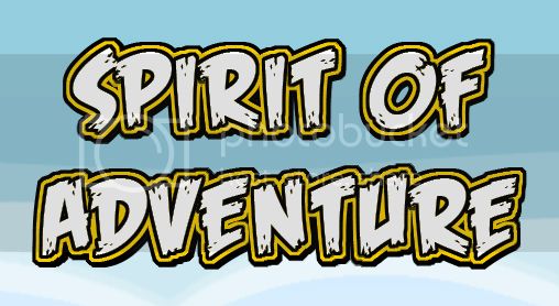
The logo from Angry Birds:
“Signature”:
Avatar:
