luxo
#1
Which Logo Do You Like
Most
- Pre-1995 (Used on Luxo Jr. Tin Toy Red’s Dream)
- 1995 onwards (Used on everything from Toy Story onwards)
I was just wondering which one you guys liked
most.
nHere’s the Pre-1995 one, I think it looks cool for some reason, the little splashes of colour between each
letter. And if you watch the Luxo Jr short found on file sharing and maybe on youtube, it has some cool music to
go with it.
Or
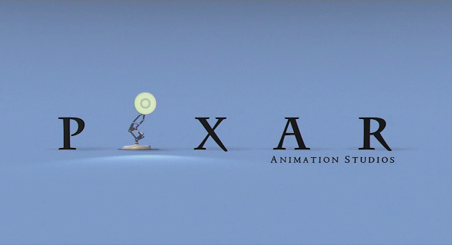
this used from Toy Story onwards. It was we all know refers back to Luxo Jr., which is great. I really like the
look of the current date logo also. I hope Pixar does not change it because of the Pixar Disney joining or
anything like that. 
So which ones your favourite
[b]I like the one that is currently being used for Pixar films (2nd one) the
best.[/b]
Mitch
#3
Interesting
question/poll, luxo.
Hmm…well, I guess I would have to go with the latter – 1995 and onwards. It’s
more “crisp”, defines the personality of Pixar in just five letters, and is simply more fun to watch.
Personally, I hope they don’t change it either, just for old time’s sake. 
Nice poll. 
[b]I think it looks cooler then the first one.
[/b]
luxo
#7

Well that’s every man/woman to him/herself (being pc here  )
)
I thinkthe first looks quite
nostalgic, it’s like when you see a TV stations old idents (logo sequences). But yeah I guess I voted for the
first because of that factor, I really do like the 1995 onwards one more. It just seems more in touch with
cinema. The other one wouldn’t work.
The second one. The first one’s fine, but I think
PIXAR as a word isn’t much of a symbol. It’s more of a word. Having an anthropomorphic lamp replace the I
personalizes it much more, so you’re in no doubt as to who we’re talking about.
luxo
#9
Yeah, the square doesn’t really symbolise anything, it
just looks cool. Wheras when you see the second one, you like, yup, it’s Pixar.
The Luxo logo is simply more
entertaining.
~~=oP
The logo that was used with
TS-Cars is the most familiar to me. I did’t know there was an old one until now.
I
prefer the newer one, simply because the old one does scream nostalgia to me, and I hate nostalgia. Also, the
box/circle design looks too cliche.
Me too.
The older one,
it just looks a little bit ‘unprofessional’ to me. I don’t know why.
I think the second one
looks more like a professional movie studio’s logo. The other one looks like an old 80s-era software
manual…
I
think it’s also that we’re so used to the recent logo, it just kind of seems natural that we’re generally more
biased to it.
That is true. After all, Pixar got
its break through with Toy Story. The old logo was pretty much an unknown. Now, more people are more familiar
with the other new one.
I grew up with the new one . The
old one just doesn’t fit with pixar to me
lizardgirl : I’m guessing cars is’t one of you tops for
pixar since you’re not a fan of nostalgia huh . I <3 nostalgia . I get nostalgia for times I wasn’t born in
. like the 50’s . it’s sounds so fun with the poodle skirts and the jukebox and the bowling .
gottalovepixar- Yeah, spot on there- Cars is my least
favourite Pixar film. Though, I have to say, Monsters, Inc. does have that kind of feeling of the past, I
think, and I like the atmosphere in that Pixar film, so I guess it depends.
luxo
#20
LOL, I’m still the only fan. But I
understand why it’s unpopular.