Thanks bright dot-dasher I agree its nice to see them all together just to see the different look the techniques bring out, Thanks for the comments!
TDIT Thanks for the boost in confidence, I will admit your comments last time were the real focus of these pictures… just trying to get the difference. I;m not that happy with the WALL-E picture… the connection between WALL-E and M-O. and like you said about the angles… perhaps thats also something I need to look at again.
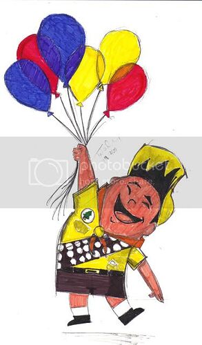
Well I might not have experimented… but I’ve taken that shot of Russell with the Balloons… and given it my usual ink pen treatment!
Hmm, I like the other colored one better. Seems too bold on this one, darker. Still excellent, but not the best looking one.
Ooh, lots of new artwork, Captain Pan! As others have said, you’re improving really rapidly and your Up sketches are great- I especially like the one with Russell hugging Dug, as it’s got that really nice mix of 2D and 3D. Well done for progressing so well and taking the advice of others to improve your own ability, and I look forward to seeing your future artwork! 
Thanks lizardgirl, its really nice to be told that my art is improving I’ve had it more in the last 2 months since returning than I have ever had in my educational career, its just given me so much confidence! And with this confidence I’ve recently joined dA… and am quickly polluting it with m DIsney and Pixar Drawings too!
But today… after a plea from ffdude1906 to see him… I scanned in my newest picture
Going to play around with this picture like I did with my recent Up ones… and who knows more Up ones might be in the offing!
Once again, great job Cap!  Good luck with the colors. It’ll look stunning, I’m sure!
Why thanks ffdude1906…
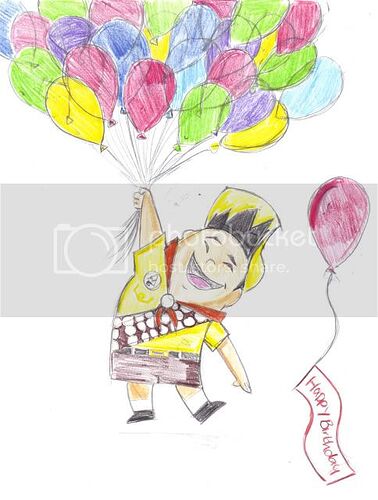
I did think I had a little longer to produce this one… But it was quite a surprise to find it was your birthday…
I took one of your favourites… and did a little manipulation to it!
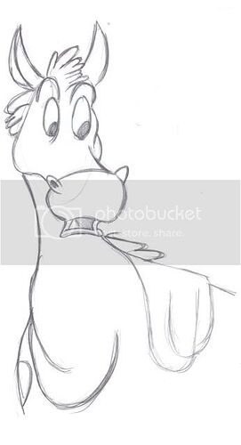
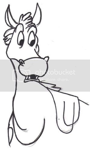
Is that B&W sketch of the horse Bullseye? Wow, I just love the expression! Definitely a different take from your usual ‘Smiley Face’ portraits. Lines are very fluid, too. Wonder what got him all slack-jawed?
I love your updated Russell with the balloons sketch more than the colour maker one (although both have their merits). Just preferred your bday gift more because the colour pencils (is it?) gave it a ‘lighter’ look. Nice pressure shading too. I’m sure ffdude1906 will love it! 
Haha, I do TDIT, I do. Those balloons must have been a pain, I appreciate the effort! Thanks again Cap! 
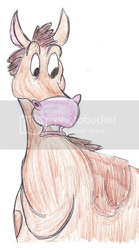
Adding your artwork to PixarPlanetdA right now, CaptainPan, and I’m very pleased to be doing so!  That Bullseye sketch is great, it really looks like a proper cartoonist’s sketch in the way that the lines flow so smoothly and his expression is really clear and easy to understand. And the colouring in of that Russell picture is great, goes with the sketchy style perfectly! The graduation of the shading could be a little more gentle, but aside from that, great work!
Well I’m glad your liking all this TDIT, I am trying to go outside of my comfort zone and become more adventurous, just like you suggested a good few posts back!
And by doing that I have actually found more confidence… Although I am starting to slowly miss my colour marker…
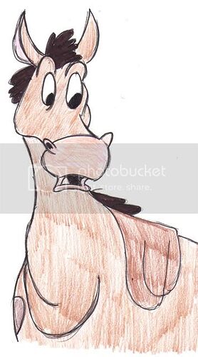
The drawing of Bullseye… is one of those Pixar used in designing Woody’s Stallion! So its not really my own idea. But then I still can’t draw anything hiden in my imagination… I can only copy!
Yep Coloured pencils are what I used for my recent sketches and that’s why I think the look so much better! although I do miss my markers, and I agree it does provide a lighter look, giving it more air and allows more shading possibilities and blending of colours!
I love your sketch of Bullseye! His expression is great! I also like what you drew for ffdude1906’s birthday. It’s really cool! You’ve posted so much fan art recently and it’s wonderful seeing just how much you are improving with every piece! Keep it up! 
Well, you can always go back to markers, Captain Pan, I don’t mind those either.  Just keep trying out new things, but if you find that you work better using the old mediums, keep doing that too! Some film directors have a trademark ‘style’, but they try out other genres too just for kicks, and they may even discover they have a new talent, so, uh… I guess art can be compared likewise.
Keep up the great work, though!
Thank you all guys… and from your responces… I have continued with the several version methods
Bullseye
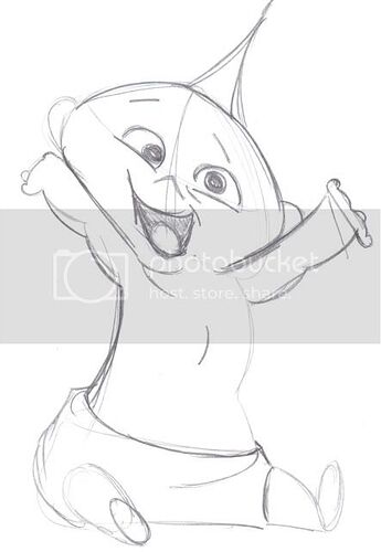
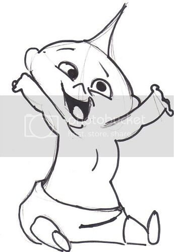
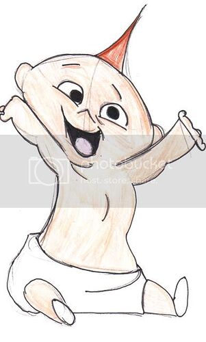
Jack Jack
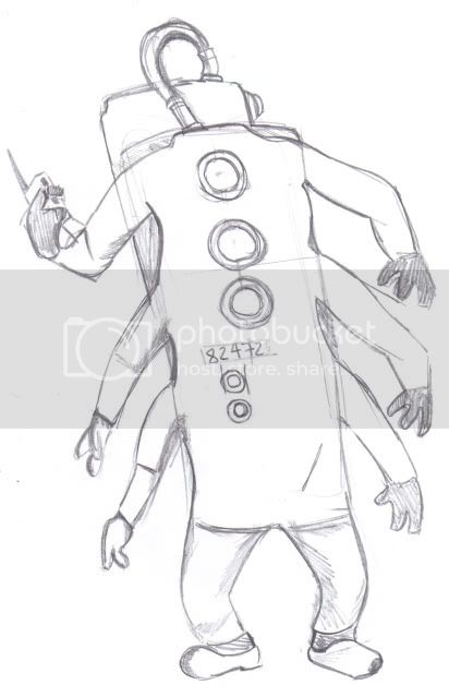
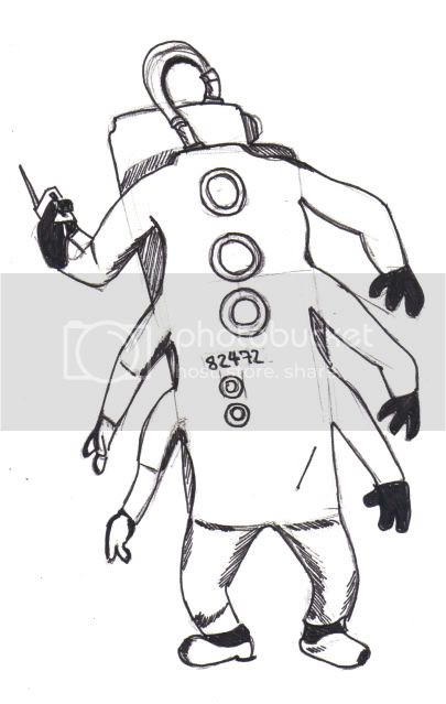
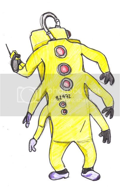
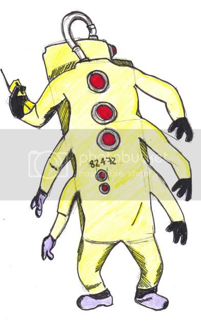
CDA
Have Fun and Enjoy!
Nice drawings! I’m glad you are continuing to show us various versions of them… although my favorites will probably always be the original pencil sketch! You already know how I feel about Bullseye; nicely done! Jack Jack is looking a bit off. It’s a good attempt though. The anatomy in his arms don’t look quite right and it looks like his one arms his squishing his face. I think you captured the essence of Jack Jack. It just needs to be refined a bit. The CDA guys is looking good. I really like that you added some hatching in the last version.
Keep it up! 
Thanks Hannahmation… I dare say I am slowly starting to grown in confidence and trying “new” and differering characters and poses…
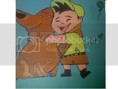
I’m now finding myself doing a bit more doodling lately. And Have in fact started a painting for my girlfriend (the pic of Russell & Dug) or her birthday.
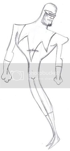
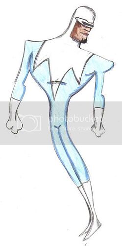
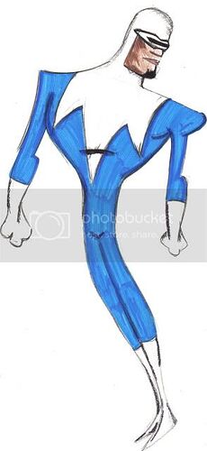
Today I’ve started work on Lucius Best… Which looks to be based on the concept for the character
I apologize for the double post… But Posting Artwork when I’m happy looking at it, cant wait for another day or for another comment!
In my new format.
Those on dA, might find that these are already posted, by myself! ~CaptainPan
I like how you’re showing us each stage of each drawing, Captain Pan. It’s cool to see how they’re developing. Jack-Jack looks sweet, though I do agree with Hannahmation’s comments about his anatomy, and you’ve got the CDA guy spot on! And as for your latest drawing, Frozone looks superb! I love the flowing shape you’ve given him, and the one with the coloured pencils is my favourite version. His fists look a little off in terms of their shape, but you’ve really captured his look!
Thank you lizardgirl I’m happy with the recent pictures I’ve managed to finish and in these latest range or “Versioned” drawings I’m finding exactly what is the better techniques for the particular style of drawing.
The image I’ve used as source for these pics have come from the Pixar Website… and in particular I copied the shape and with the exception of the Belt and pants that Pixar appeared to have for Frozone… I’m not happy with the hands… but then I really couldn’t see how they looked on the website…
Hopefully I will get more done… and hopefully they will be of this same standard before I make my ultimate challenge/project
My Idea for the Project is to…
Place one character from each Pixar movie on an individual canvas. As A representative for that movie. So at the moment 10 Canvases are going to be used and hopefully completed before Toy Story 3 comes out.
I have a vague Idea of what each movie will be getting.
Toy Story: Woody or Buzz (Leaning toward Buzz)
A Bug’s Life: Not Sure Yet
Toy Story 2: Bullseye
Monsters Inc: CDA Member or Boo in Costume (Leaning toward Boo)
Finding Nemo: Not Sure Yet
The Incredibles: Jack Jack or Frozone (Leaning toward Frozone)
Cars: Sheriff (eyes as in the picture I did with Lightning and Doc racing into the foreground)
Ratatouille: Not Sure Yet
WALL-E: Not Sure Yet
Up: Russell + Balloons or Russell + Dug
Following a few conversations with both Simon-Simon and thewisecookiesheet along with input from my mentor Mitch I am adding a small logo/signature from the movie into the corners of the canvases.
Its taken me nearly a month to complete… and with just 3 days until my girlfriends birthday… here is my final present to her…

Looks great! Wet media is tough, but you’ve managed to put together a nice piece! I think Dug’s collar could use a bit more color, but otherwise, it looks great!
