Ok… So I’ve started with a few simple small ones and we’ve had 2 bolt ones… and now my first Pixar Themed one
It’s very simple but I’ve Impressed myself!
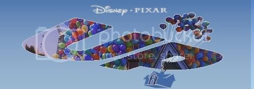
Ok… So I’ve started with a few simple small ones and we’ve had 2 bolt ones… and now my first Pixar Themed one
It’s very simple but I’ve Impressed myself!

I like it, Captain Pan! That’s a really cool idea, simple but it works well.
Thanks Lizardgirl I’ve been watching everyone’s signatures over the past month… and I always felt in awe of what I was seeing and then envious cause I thought I couldn’t create something like that… I Still Can’t, but Practice Makes Perfect…
My Girlfriend wanted one for her signature on Disney Themed Forum and as She’s Mad about Mater
I knocked up this
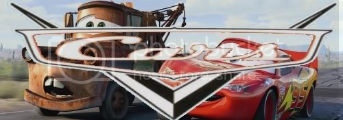
Its not overly impressive but I’ll Stick to doing eraser work and then move in to quirky catchphrases and such by the time I graduate from my teaching degree (3 years away)!
here’s another something
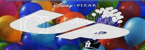
Wow - that’s pan-tastic! How did you get the balloons in the logo like that?
I’m not entirely sure… Pure luck I think…
I placed them in first as the base layer for the banner.
Using the original logo I layer it on top
Used an Erasing tool that only works on the one layer not the entire project. That allowed me to get the image from behind in on the logo I wanted… I did the exact same thing with this Bolt One
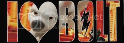
The only real problems I’ve had with the process are
But thanks rachelcakes1985 for the comments… and the Pun too! ![]()
I like your ‘cutout’ signatures, Captain Pan. Regarding your problems erasing the layers, maybe you’d like to try the Quick Selection Tool?
I used to erase the top layer bit by bit too until I found out this tool, then now I just do a rough selection (never mind if some bits of the portion you want to delete are still there) of the bit that I want, copy it, paste it in a new layer, delete the old layer, then use the eraser to ‘dab away’ at the unwanted remnants.
Hope you got my explanation. I’m a relative Photoshop noob too, but I learn every day. ![]()
Really nice work Captain Pan. Excellent job for a start.
That Cars one is cool, but I have to say that the Bolt one is your best yet, Captain Pan! It really stands out and is very clear, and I think it’s the neatest one yet. You’ve got some really original ideas!
This might sound stupid…but how do you add a signiture onto your profile?
Better to ask a stupid question than to remain stupid, I always say. ![]()
Check the ‘How-To’ thread and ask us if you still don’t understand. ![]()
That’s pretty cool. I like the clear UP that shows the balloons behind it.
Think its about time I say thank you and reply to your comments…
The Star Swordsman, lennonluvr9 thank you for your comments… Hopefully I’ll move on from this little start with some more clean and just as good images!
lizardgirl I agree with the Idea that my Bolt ones are the best I’ve done so far!
I just don’t like the fact I’m having problems ensuring the erasing is perfectly clean! And that could be mainly down to the fact I’m using a programme called “Gimp2” to do it and I’m not using a mouse as such but the mousepad on my laptop! But thedriveintheatre thank you for your advice never-less!
Whoa, they’re spectacular! I like they style of the Up ones, and they all look amazing with how you did the titles. Great job.
Do you take requests Captain Pan?
bright dot-dasher Thanks for the comments… I really thought the Up ones were good… but then My Bolt one was miles better… Maybe more of Disney’s latest Superstar are to come…
I would say not really… But then I would be lying as I did one for my Girlfriend…
and saying that I’ve just done an Incredibles one… Inspired by someones Avatar and Signature I may add
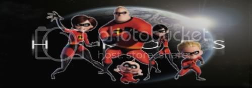
Ok… its not perfect but Its still a Step forward from where I was originally!
The Heroes one was pretty clever! Although I think it would be cool to see the actual word Heroes, maybe in front of them, instead of behind.
The Heroes one is so far my favorite that you have posted up Capt. Pan. It looks so cool and original. Keep it up.
Oh my gosh! You use the mousepad? ![]() Maybe it’s time to invest a mouse. They’re really not expensive, you can get a decent one for a couple tens of bucks.
Maybe it’s time to invest a mouse. They’re really not expensive, you can get a decent one for a couple tens of bucks.
Anyway, like your new Heroes sig. Personally, I don’t mind that the title is obscure, that way it is more of an in-joke that only fans will ‘read’ and ‘get’. But again, unless it was intentional, I’d rather have the borders around the characters erased out so that they blend seamlessly with the background title, rather than having ‘fuzzy edges’ sticking out.
Great idea though!
Oh, and I love your Lion King/iPod avatar mash-up. That was cool. How’d you get the silhouette with the iPod earphones included?
Yeah I know thedriveintheatre its weird I know… although I feel more comfortable using the mouse pad than I do using a mouse… But I really should invest in both a Mouse and a Graphic Tablet… but then I’d still get the problems I do now if I was using a mouse (i.e. The Fuzzy Edges) and My sketch lines when I draw normally will ruin what I’d create using the Graphic tablet!
Thanks to all your comments on the Heroes Incredibles signature. I see where your coming from lennonluvr9 in having it in the front would and could make the connotations and symbolisms I’ve linked easier to read. But as thedriveintheatre has said by having it obscured by the Family it makes more for a tongue in cheek opportunity.
Yet again though… I’m not 100% happy with it… I thought the sizing was incorrect but thedriveintheatre has pointed out another problem which I’m going to have to sort out… eventually…
The Star Swordsman Why I’m happy your favorite… Whilst watching Heroes earlier in the week and being on here your signature and comment on the last set of pictures provided the inspiration.
The Lion King/iPod Avatar was taken from a friend on another forum, and I have no idea where she got it from…So I can’t and will not take the credit for the coolness of it…
I definetely can not wait to see more from you Captain Pan.