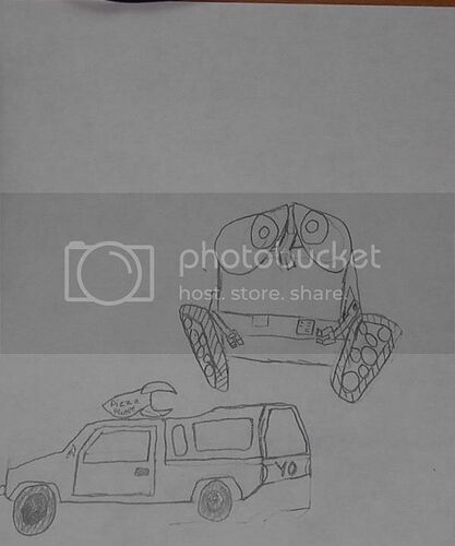
You know how well I can do with a photo editor well now you can see how well I can draw. The drawling are Wall-E and the Pizza Planet Truck.
Pretty cool drawings there nightwheel! ![]()
Thanks
I like your drawings nightwheel!!! ![]()
You did a good try with these. I think the rocket could be a little bigger. And I feel like you can use more practice on the WALE drawing, but a worthy effort. Nice work.
I agree with The Star Swordsman: a worthy effort. Practice makes perfect, but keep up the good work, nightwheel! ![]()
It’s been about 2 years since i drawed things with great porption and detail. Mitch you want me to try to draw remmey?
Wow – two years? You should get back in the act – I’m sure you could whip up something spectacular if you practiced more! Not to be offensive or anything… ![]()
And Remy? But, of course! I’d be honored! Draw all the Remys you want. ![]()
Ok well a slight exzagration but it been a while. It’s like riding a bike. Ya never forget. But I used to do some wildly cool artwork. But now I am a little rusty. Ok I will draw Remy
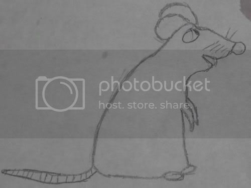
Well Mitch heres Remy:

I think Remy was nicely done, but I still see room for improvement. For example, maybe the feet can have toes and hands can have fingers. And maybe add some deatil into it. But all and all, nice go on it.
Thanks TSS the next one will be way better
may I make a suggestion? I suggest that you draw Pixar related characters that you know that are your best work, add it some details, and then your art will be just incredible.
Thanks TSS I will keep that in mind. but for right now I am figreing out what i can and what i can’t realy do.
Wow Remy looks so good, good job nightwheel!!! ![]()
Very nice works here, nightwheel! I especially like your Remy drawing, but as TSS said, a little more detail can really add a lot to a picture. Good effort! ![]()
Yoo Hoo Mitch I finshed Remy
Remy looks good, but you need some more practice.
Heheh – very cute, nightwheel. ![]()
Guess I’ll take PV’s approach, however, and add some minor critique: Your art connotates good effort, but I would say that it is more like child’s artwork. Basic shape is there, and you know who the character is, but some depth, proportions, and maybe even a little bit of shading would be good.
Just a thought. But keep it up, nightwheel! Just keep practicing and you’ll get better. ![]()
