Too bad the syllables aren’t right, but nice anywho!
The syllables aren’t right? What do you mean?
when the theme song sings, they say “Teenage Mutant Ninja Turtles!” in a repetitive form. The syllables for each word has to match correctly to make it sound catchy, but with “The Spirit of Adventure”, you got way too little syllables to even work part of the words into 2 syllables at once.
One of the most overrated movies ever. Here’s the Avatar logo.
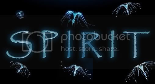
Pretty good job. ![]()
Very good job on what I agree is a very overrated movie.
Very good on a movie that I disagree is overrated.
Ok, I admit it. This is out of place. My creativity was down and I didn’t know what to do next. So I made a bad decision. The logo from the mediocre Twister.
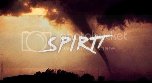
I thought Twister would had been good if i actually watched it, but it does show some unrealistic features of a tornado strike!
Is Twister the one with the cow? ![]()
Exactly. The flying cow.
Haha, I remember it now ![]() I liked the cow
I liked the cow ![]()
Oooh…Twister. Nice one!
Another no-good movie, but with a logo I like. Stephen Sommer’s Van Helsing.
And I also liked that movie too.
I realized that not all my avatars were exactly like the signatures, so I should upload them too.
During my first months as a member, I didn’t use any signature, just these UP avatars, related to my username and made by Eric Tan.

I remember all those avvies! Memories…
I’m trying to remember them…
They were used when he first joined the boards, before you came.
Yeah, long before that. You’re from December.
After that, I started to make my own logos. At first they were all Pixar related.


When I ran out of Pixar movies, I made the Disney logos that appear in them:
