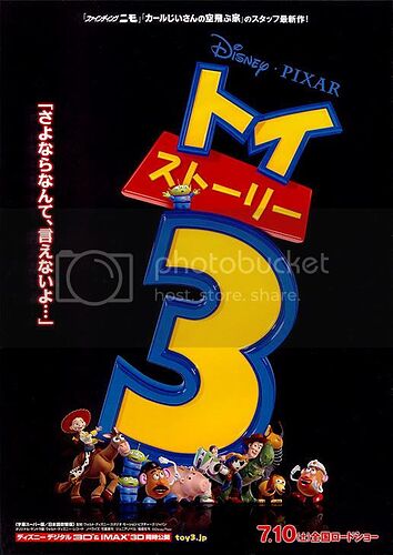
If you compare the posters of TS3 and TS1, Watch out for the differences in animation. It will stun you.
Character models yes, but there is no animation on posters, animation requires the characters to move.
Sorry, just a pet peve, people using the term “animation” to describe still images.
Can we have a Slinky?
Those really cool! Still very simple, design wise. I really want that Buzz one
I absolutely love seeing the words ‘Toy Story’ written in Japanese in the traditional Toy Story style, haha. Thanks for showing that to us, Wall_E21.
I love each and every one of these. Sadly I only have room for like, 2 posters on my wall. I rly hope they make the group picture one (That’s in Japanese?) with an English title. ![]() that’s one that I would LOVE to have, because it would involve everyone.
that’s one that I would LOVE to have, because it would involve everyone.
is that Woody or Jessie’s foot sticking out the 3? if it’s Jessies why is it written like young Andy?
I spy the Luxo ball in the top right corner
If you look at the pants, they’re Jessie’s. Woody’s shoe has the N written backwards as well.
Actually the N isnt backwards, which I find odd.
Another thing I find odd, the final poster doesnt say the full name, Toy Story 3. it made sense on teaser posters, but I expected the final theatrical poster to have the full name. most people might not need the full name to know what it is, but your always going to get an occasional grandmother or someone who thinks theres a movie out there called “three”.
It’s Jessie’s boot. Andy had mastered writing letter’s properly by the time he got Buzz.
That would be my aunt, because when we went to see Percy Jackson, I saw a stand-up poster and I was like “I can’t wait for that to come out!” and she was like “3?” and I was like “No…”
WOW!
Love it! Love it! Love it!
It is already the wallpaper on my iPhone!
I want a desktop version now for my computer!
Oh did I mention I Love it!
Awesome! I love it! But I kinda wish they do one more poster where they do the full Toy Story 3 instead of just the 3
I wish they would do a poster with a background for once. For me, I think this one is too busy, while at the same time being too simple. What I mean by that is there are too many characters fighting for attention, and as mentioned, they don’t have the full title of the movie.
I’d like to see something with the cast in Andy’s room and the full title.
This is my favourite poster so far. I have to agree with commenters that it would be better if they spelt the full title, but other than that, I like its ‘crowded-ness’. Reminds me of one of the Cars poster where they showed all the character at Radiator Springs. You can stare at the poster and try to pick out your favourite characters.
Not to mention it gives the impression of a playbox. So fun! ![]()
I really like this poster as well. But then, I’ve always been one who adores those ‘crowded’ images, like Where’s Waldo. xD So much detail.
Also, I really like how they hid a Luxo ball in the corner.
Aaaaa… This poster really sums up my feelings about TS3 perfectly - a mix of “Oh, this is going to be so cool” and “Oh, my gosh, they’ve got way too many characters, how are they ever going to make this work!?” Of course, it’s Pixar, never doubt the power of Pixar, but… man, that is so many characters!
Good catch on the Luxo ball.
