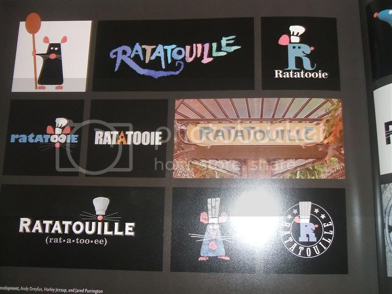
Here are four Ratatouille logos used to promote the film, as well as being used on Pixar merchandise. Which one is your favourite, and why?
1.
2.
3.
4.
I prefer the original and the best: number 1. The other two oval logos look blank without the pronunciation, and chef hat. The black one does look good on the side of the Ratatouille DVD and on the main titles of the film itself, but overall it was a great choice to go with the logo they picked.
My favorite is number one, it’s very creative. Numbers 2 and 3 are essentialy the same besides the hat, and are missing a big part of the original logo. Number 4 is cool but too plain for my taste.
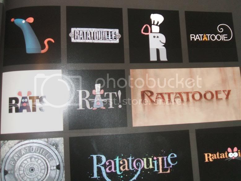
There are tons of other possible logos you can check out in The Art of Ratatouille, by the way.
I actually think the second one from the top-left in the first picture is better than the logo they ultimately chose. The one at the center of the bottom of the last picture is nice, also.
Thanks for those images, martini. I love seeing how something as simple as the title of a film can change so much. I’m pleased they didn’t call it ‘Ratatooie’, or ‘Rats!’ though- they just aren’t as classy as ‘Ratatouille’. But I do love the creative style of some of those logos, and one or two of them are very ‘Your Friend The Rat’-esque.
As for the original question, I’d go for the first one. The other ones actually look as though they have something missing from them.
Hmm… Well, to tell you the truth, I really do prefer the fourth logo above all others, but that is probably due to the fact that I like the color black quite a bit. The logo itself also seems a little simpler and less “busy” to me than the other logos, for some reason.
As far as merchandising goes, however, I think that the first option was most likely the best choice, since it stands out, is easy to read, and has a fun flavor to it.
The first one! The (rat-a-too-ee) cracks me up everytime XD. Especially since the way you pronounce it is written differently in every country. And in France, that subtitle wasn’t even there, because French people already know how to pronounce it, haha.
what i don’t get is, if theres a japanese ratatouille, how do they make out how to pronounce it?
O, and by the way, I like number 1 and 4 the best, because 2 is sort of the same thing, but not as clear and number 3 is kinda just like a blurry number 2 with a pot of soup in the background.
In the case of Ratatouille being released in Japan, the movie is actually called “Remy no Oishii Resuran” which translates as “Remy’s Delicious Restaurant” - so they didn’t have to use the original logo with the phonetic spelling in that case. As far as I know, the actual meal in the movie would be called ratatouille, but pronounced the Japanese way.
Sylvermagykan - Technically, the bistro, Le Ratatouille, was owned and run by Remy, Linguini, and Colette, with Anton Ego substituting/acting as an investor in the business. I suppose that you could say that it really is, in a sense, Remy’s restaurant, it’s just that he needed a “leg up” (via Linguini and Colette) in order to get the cafe going.
As for being able to “taste” a restaurant: Well, that is simply a metaphor, or a “play on words”, if you will. A restaurant can become “delicious”, in a way, if it is considered to be one of fine quality.