The creation of Onward’s suburban fantasy world was a lot more deliberate than you might expect. Of course Pixar films are always the result of years’ worth of research and minute attention to detail, but it all looks so effortless. How hard could it be to populate ordinary neighborhoods with centaurs and trolls? Actually it was quite challenging, building a world both old and new at the same time. Here’s a rundown of how the crew in art, layout, editing, and lighting rose to the challenge.
Art – Noah Klocek, production designer
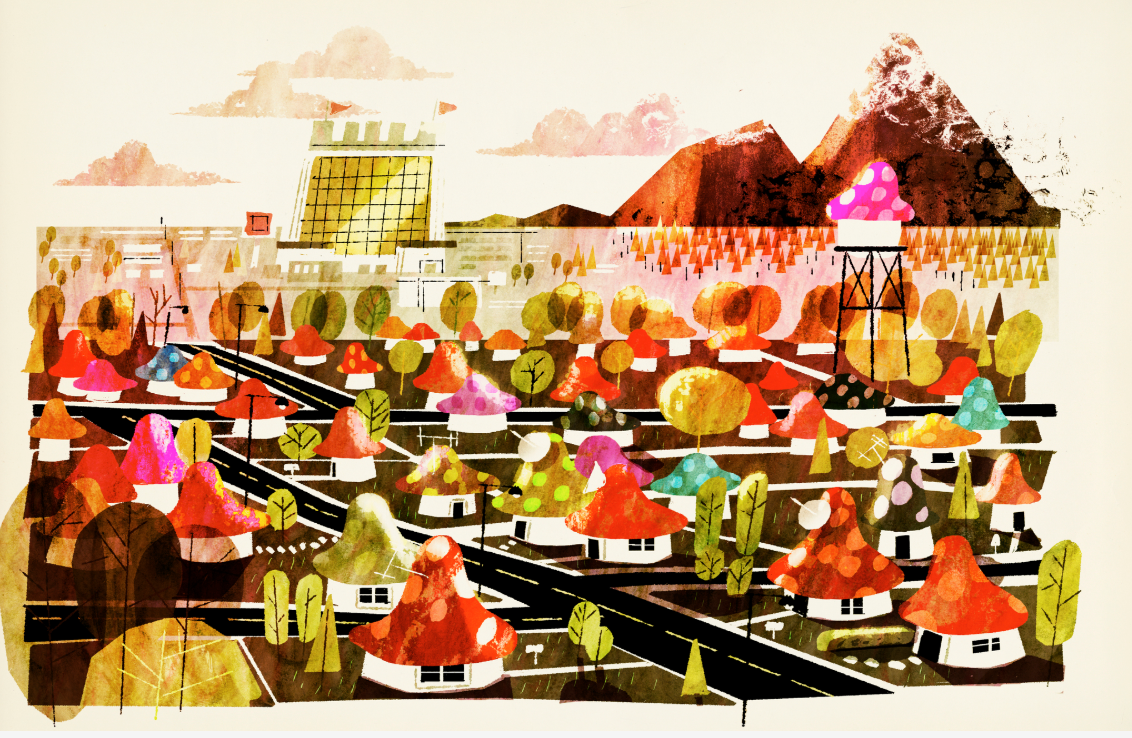
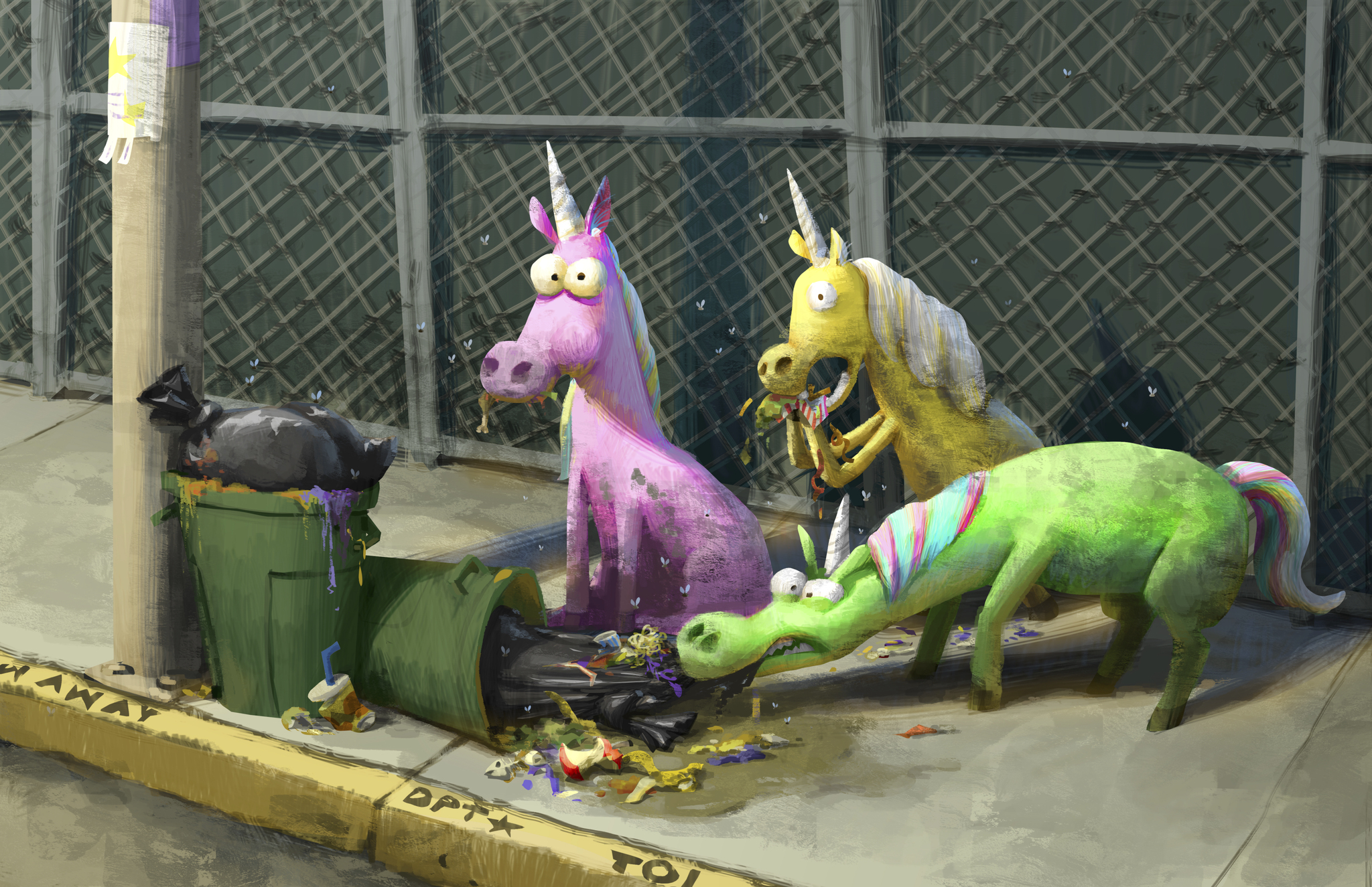
One of the challenges with Onward was making fantasy creatures in a modern setting acceptable to an audience. This was achieved by making the world’s familiar elements much greater than the fantastical ones. Percentage wise, it was 70% familiar, 30% fantasy. The juxtaposition of those two elements were also represented by two more key concepts: chaos and order. And those concepts were further embodied by our main characters, Ian and Barley.
The suburb itself was inspired by the Midwest, specifically where Dan Scanlon grew up. The array of fantasy creatures and elements were made to resemble what Dan called a “sticker book/trapper keeper fantasy.” The film’s brightly colored posters definitely pay homage to that aesthetic. And the film overall is meant to appeal to fantasy lovers and non lovers alike.
Layout – Adam Habib
Technical aspects were also employed to reinforce the film’s blend of chaos and order. Two types of camera styles were assigned to the Lightfoot brothers: a normal one for Ian that was closer to a human perspective with a restrained movement; and a mix of wide and long lenses for Barley that felt more unpredictable. Because magic is also unpredictable, it’s difficult for the camera to keep up with it. This is similar to how Ian reacts to magic, and by extension, the audience.

PROGRESSION IMAGE 3 of 6: CAMERA AND STAGING – The Camera and Staging team (sometimes known by its traditional name, Layout) uses the principles of cinematography and film language to translate each moment from the hand-drawn storyboards into the three-dimensional cinematic shots that make up the finished film. This team determines the composition of each frame, as well as the choreography of camera and character movement (known as Staging) within the virtual sets. They work closely with the Director and the Editorial teams to determine the right timing and sequence of shots to best communicate the story. © 2019 Disney/Pixar. All Rights Reserved.
Not all of the magic in Onward is chaotic however. Wizard magic belongs in this category, with its dynamic and graceful camera movements. That’s what Barley idolizes and what Ian tries to master.
Editing – Catherine Apple
The editing department spends the most time on the film, anywhere from three to five years. With Onward, it was four years. The first step in the process involves the storyboards. They are broken down into sequences with temporary dialogue. In the early stages before the principal cast was announced or involved, Dan Scanlon voiced Ian.
After the storyboard sequences, sound effects are added. The effects are so integral to the editing process and they all have to be created. Examples include ambient sounds, dogs barking, and a car engine. A vast sound effects library at Pixar certainly helps! Since Guinevere the van is Barley’s mighty “steed,” the car engine roars to life with a horse’s whinny. Then a temporary score is added along with the sound effects to scenes with dialogue. Sound effects also reflect chaos and order: controlled sounds and dialogue for Ian, while Barley’s dialogue is often very fast and overlapping with other sounds. He also got the louder sound effects.
Lighting – Jonathan Pytko, lighting supervisor
As expected of Pixar films, the lighting is one of the most compelling visual elements. The goal here was to tell the story through light and color. The familiar part of Onward is made up of funny and heartfelt moments that are meant to evoke comfort and warmth. These scenes also help the audience grow accustomed to the world. The fantasy is much more mysterious, saturated with deeper colors, as in the scene where Ian and Barley use the conjuring spell.

PROGRESSION IMAGE 5 of 6: LIGHTING – The Lighting department helps to integrate all of the elements – characters, sets, effects, etc. – into a final, fully visually realized image. The Lighting process involves placing virtual light sources into the scene to illuminate the characters and the set. Technical artists place the lights to draw the audience’s eye to story points and to create a specific mood. The lit images are then rendered at high resolution. © 2019 Disney/Pixar. All Rights Reserved.
Onward‘s visual language is very rich, and deeply informed by specificity. It’ll be a treat to watch the entire film next month and pay attention to all these details. Last modified: February 12, 2020


