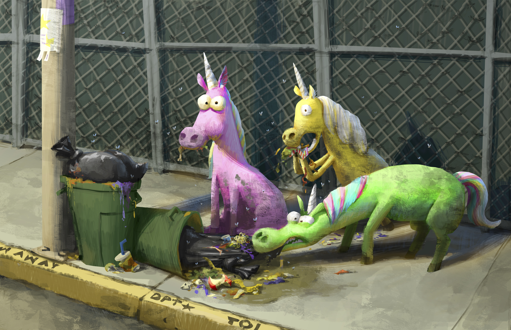
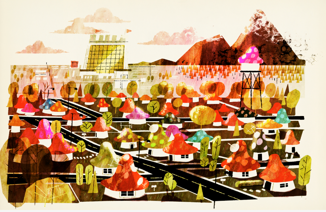
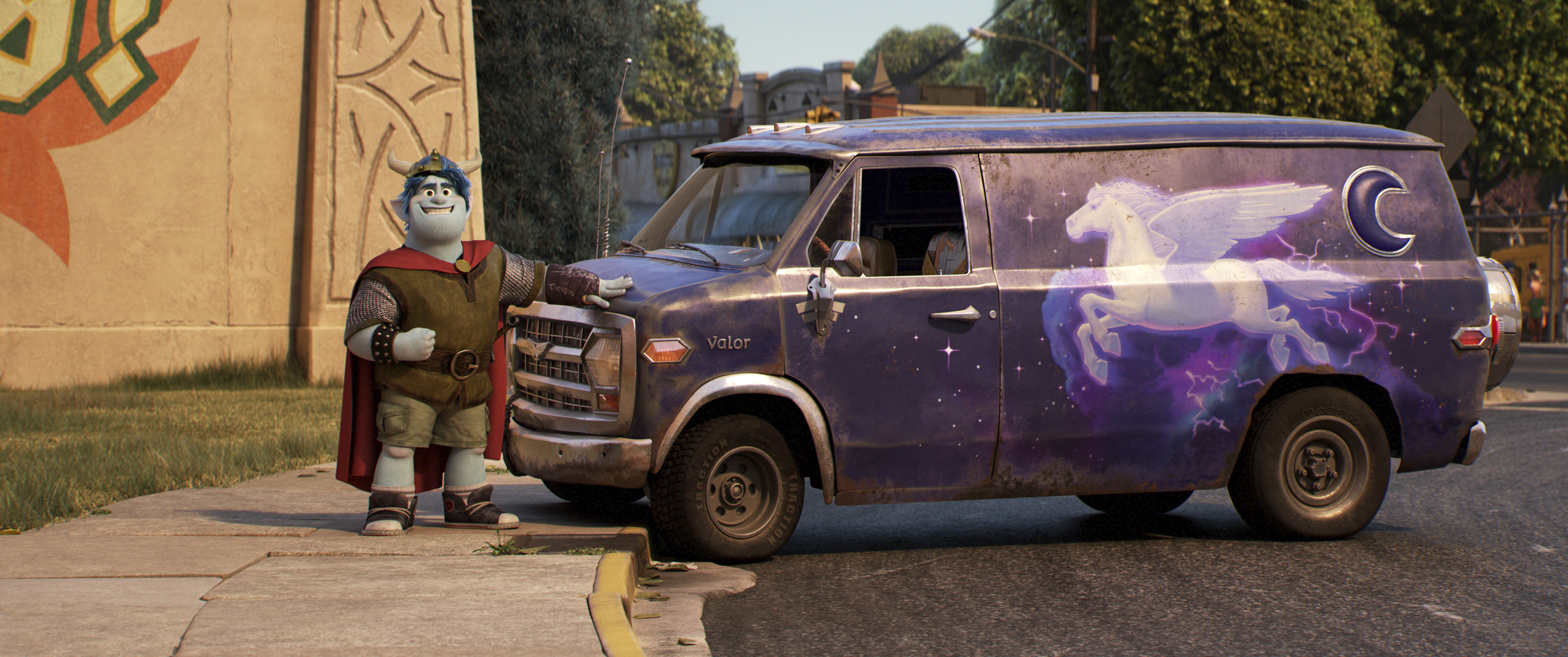
There are 240 characters in Onward – an eclectic mix of make believe creatures numbering 13 species. Rest assured that the vast majority are background characters. Still, these characters, be they trolls, centaurs, goblins or sprites, had the major responsibility of making this world feel authentic. They even had an impact on the design of the protagonists.
Jeremie Talbot is a supervisor in the character department. On this film, he and his team had the unique challenge of designing a pair of legs as an actual character. Dad is more than just his bottom half, but the crew really had to get creative in order to convey that without his top part. They made the choice of showing Dad’s ankles because that was the only way he could emote, which of course led to that remarkable scene where he taps his foot to communicate with each of his sons. The animation department had further work to do here which I’ll get to later.
So what about the characters who actually have heads, arms, torsos, and speaking lines? What did the character development process entail?
Jeremie and his team were responsible for creating the final render from Dan Scanlon’s ideas and the art designs. It’s a constant collaboration between the character and art departments that results in the final image. But long before that is the initial computer sculpt that undergoes revisions in art and which Jeremie’s character team continuously rebuilds.
As Jeremie pointed out, the Art Of books, as immensely beautiful and informative as they are, rarely show the continuity between the original and final images. This presentation avoided that. I’m a huge fan of concept art and often find that I like certain early designs that never make it to the finished film. We got to see why and how this happened in Onward.
The initial designs of Ian and Barley were compelling to Dan Scanlon. At the most basic level. the brothers’ appearance reflected their personalities. Ian was skinny and awkward while Barley was burly and confident. One of the main concerns was if those first designs could convey emotion and range. So the designs were always evolving to reach that goal. The other family designs also helped to influence Ian and Barley’s.
Ian looked a little too mischievous at one point. He no longer seemed like the gawky teen who’s unsure of himself. His design was then modified by enlarging his features. making his hair much messier, and putting him in oversized clothes. The story changes as the designs do, lending much more specificity to the characters and plot. Ian’s poofy cloud of hair makes him all the more endearing and further sets him apart from Barley. His bigger clothes also ensure that he neither “fits in” in his skin or in the world at large.
The characters are next brought to the shading department, but at this point, they look like gray plastic, as shading lead Ana Lacaze noted. Physical attributes of the characters are further defined, and shading is also tasked with determining the texture of skin and hair. A really cool detail that emerged was how they were inspired by the way light bounces off succulents: they stayed true to that principle with Ian’s curls.
Shading works closely with art, lighting, modeling, rigging, and animation. Their work with the materials, such as surfaces and clothes, also helps with character transformations. The most prominent example is Corey the manticore. She loses her restricted clothing and hairstyle, and fully embraces her true identity that has been stifled for so long. The same is true of Ian, although his journey to confidence is a lot more subtle.
Below are Matt Nolte’s character notes for the Lightfoot brothers:


Details like those above aren’t the only crucial ones. The crowds in Onward add a lot more depth and context. They provide richness to this world, making it much more expansive. Sequoia Blankenship played two film clips that showed just how necessary the crowds were. They make the film come alive, and they function as characters too. The tavern scene with Corey perfectly visualized this: once her fierce warrior side is unleashed, the patrons in the tavern become a single character connected by their collective shock.
A balance had to be struck though, so that some of the characters, like the huge trolls, didn’t overwhelm any scenes or distract the audience. The trolls blend in so well that you might not even notice them!
There was a lot of study that went into how the fantastical creatures moved. Directing animator Allison Rutland led a team of 85 to create performances and movements. Because these characters all have histories that informed how they evolved, the animators had to incorporate those into the ways they moved. Corey in her high heels, as opposed to walking on all fours, was a lot more awkward. Once she ditches the shoes, the animators borrowed from lion footage to base her newly powerful and fluid movement on.
For the centaurs, the animators relied on footage of horses indoors – and it was important that they remained true to horse physicality and the difficulty horses have sitting down. And their overall difficulty moving around in enclosed spaces. The history of centaur aggression also affected their physicality. They’re as wild as untamed horses, but they’ve evolved into tame versions of themselves. Colt Bronco drives a car instead of running majestically. Allison described him brilliantly: “swaggering confidence of a cop in a horse body.”
It makes perfect sense that there’s a character in this film that is still much more bizarre than the others. Thanks to the effort of everyone involved, these elves, mermaids, and unicorns aren’t out of place in a modern setting. A pair of legs detached from the rest of the body…not so much.
When it came to Dad, the goal was to make him funny and sincere. A tall order that the animators achieved with just as much care and detail as the other characters. Animation and simulation were the two main components. Animation was concerned with his lower and upper half along with posing, while simulation dealt with his physicality. There were other factors involved, like how the pants get up without an upper body and what happens when they get pulled. Animation tests of Dad’s upper body, after Ian disguises him in clothes and sunglasses, were also incredibly useful. More of his personality came through in the way his top half would flop over.
They used reference footage for Dad too: Dick Van Dyke! In his prime the actor possessed “tremendous physicality.”

Just the few seconds of Dad in Onward‘s trailer were emotionally potent. That emotion combined with humor elevates his role further. Last modified: March 4, 2020


