There is something Ling Tu, the Sets Shading Lead on Toy Story 4, said during the It’s All in the Details presentation at the studio back in April that I think is very important. She hoped that we could feel the love that was put into the sets. The intention and purpose of Pixar films are not only the result of painstaking research, but painstaking love too! And that love extends to the locations as much as it does to the characters. The level of detail in Toy Story 4 is so intricate that even the sharpest eyed viewers might not notice – and that’s exactly the point. Regardless, each detail is both deliberate and necessary.
Tu was joined by Characters Shading Lead Alex Marino and Graphics Art Director Craig Foster to give us an in depth exploration of all the details.
As we’ve learned, the goal of the Toy Story films is to allow audiences to see everything from a toy’s perspective. Achieving that in Toy Story 4 relied on a number of factors, like making the sets characters with their own backstories and conveying the journeys of the toys through subtle visual hints. Something that was emphasized throughout were the imperfections in each detail, which allowed for greater authenticity and added a richness that would otherwise have been missing if the filmmakers aimed for perfection.
While it might be impossible to spot them all, here are some details (and Easter eggs!) to keep an eye on when you watch Toy Story 4.
Top 5 Sets Details
- The leaves in the reunion scene between Woody and Bo Peep make Woody appear smaller and toylike. Pay attention to their texture, as they have the same veins and holes as real leaves do.
- The reunion scene takes place in a dried creek bed. There’s a sprinkler box there to remind the audiences that this is still happening in the human world.
- Dust in the antique store is very specific and just the right amount had to be applied. Take a look at the comparison image below – there’s a clear difference between them. The final frame still conveys the store’s age and unique history, but the dust isn’t distracting as it is in the first one.
- Another crucial element of the antiques store is that it makes Woody feel out of place. It’s also the last place any toy wants to be, which is why Gabby Gabby is so eager to leave. The subtleties make it feel that way, without the filmmakers being obvious about it.
- As Tu explained, carnivals draw you in with flashy lights and colors, but they’re actually shabby when you take a closer look. One of the ways they zeroed in on the shabbiness was the carnival prize grid where Ducky and Bunny spend all their time. The image below is fascinating because it’s something we take for granted and it’s distinctly unglamorous. But the filmmakers still took the time to include it for that extra layer of credibility!
Top 5 Characters Details
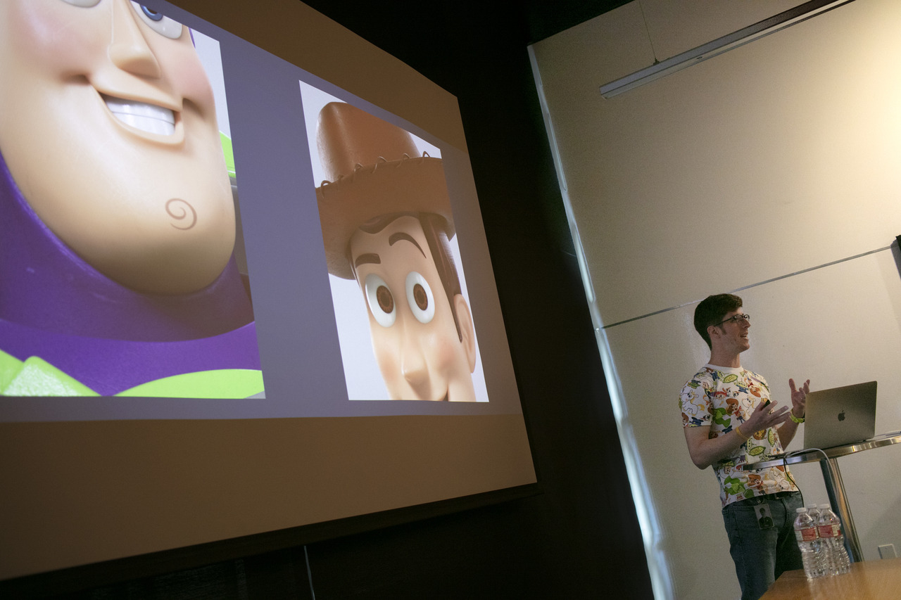
Photo by Marc Flores. ©2019 Disney/Pixar. All Rights Reserved.
Just like the antiques store, it was important to show how our toys have aged too. This was achieved by taking their journeys and motivations into account. Alex Marino also explained that subtle updates helped integrate the characters into the new settings.
- Pay attention to Buzz’s stickers – they’re peeling. He’s no longer the glossy space ranger in mint condition.
- Woody we know, has been through a lot. The micro scratches on him clue us into that and remind us that he and Buzz aren’t new toys.
- Bo Peep’s porcelain isn’t as pristine as it was before, which makes sense considering that she’s been living as a lost toy. Her garments are a little shabby too.
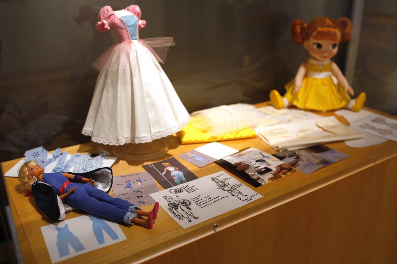
- Gabby Gabby is inspired by dolls of the 1950s and 1960s which were mass produced, but her hand painted features and the nylon quality of her hair are a contrast to the more generic features.
- Since Gabby has been sitting on a shelf for so long, her dress is desaturated. She’s often in the dark, which would explain why her eyes are ominous rather than soft and inviting.

The Toy Story 4 art gallery, as seen on March 18, 2019 at Pixar Animation Studios in Emeryville, Calif. (Photo by Deborah Coleman / Pixar)
Top 5 Graphic Design Details and Easter Eggs
Here’s something you won’t see in Toy Story 4: Woody’s Round Up. Craig Foster was deliberate about that because Woody is meant to feel out of place wherever he goes. To that end, no Western style fonts appear in the film either. Here’s a handy list of (more than) five Easter eggs to be on the look out for instead! And these are just the ones we were told about. A good chunk of the 8,000 graphics in the film reference past Pixar films.
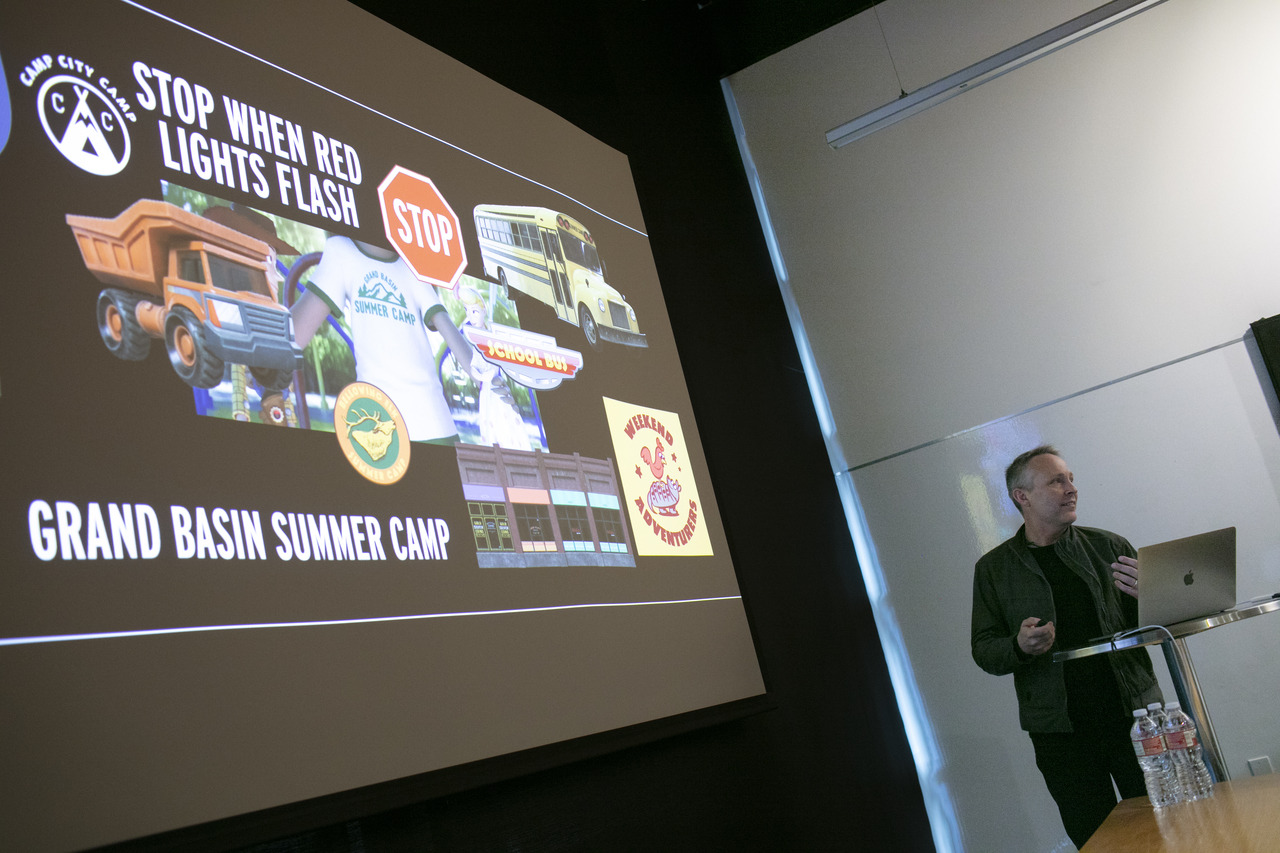
Photo by Marc Flores
- A Victrola in Second Chance Antiques has a record of Ernesto de la Cruz songs.
- Paintings in the film include one of Alpha which is reminiscent of John Singer Sargent; the classic ‘dogs playing poker’ with Dug, Muntz and the other hounds of Up; Riley’s dad as a conquistador (?!); and Angel Kitty from “Toy Story That Time Forgot” in Margaret Keane’s signature style.
- Fun ads in the film include 1940s Triple Dent Gum (and now I’m humming the jingle of course); 1950s era Eggman Movers from the first Toy Story; Hud’s Garage, a reference to Doc Hudson; and “Small Fry’s” Poultry Palace, also from the ’50s.
- The pinball machine has a tiki theme and naturally, the tiki heads from Finding Nemo are there.
- A really cool graphic is Duke Caboom‘s maple leaf. Not only is it a symbol of his Canadian heritage, it looks like an explosion too!
As always, this visual storytelling expertly reinforces the film’s main themes. The labyrinthine aspect of all these details doesn’t overwhelm the characters; they blend into the background of the story and beckon us to take a closer look.
Last modified: June 19, 2019
