Pixar caused quite a commotion when they released the final trailer for Toy Story 4 in March. It had nothing to do with the plot, but with the appearance of a character. And no, that character was not Bo Peep, whose return in this latest installment has made fans very eager. No, the character that sparked so much discussion was Andy. Just read this headline: “People think Andy looks like he’s had plastic surgery in the trailer for Toy Story 4” along with the series of tweets in the article. Andy does look very different – and there’s a reason for that!
CG animation has obviously progressed since the mid ’90s. Pixar caused another commotion with the latest TV spot for Toy Story 4; this time, the gorgeous cat left viewers in awe. In fact, our feline friend made it onto Twitter moments like Andy had previously.
The mesmerizing cat gif was made by @andstarlings! ? #ToyStory4 Pixar’s progress in life-like animation may be best demonstrated by a cat https://t.co/BpCk1FICEr
— Upcoming Pixar (@upcomingpixar) April 19, 2019
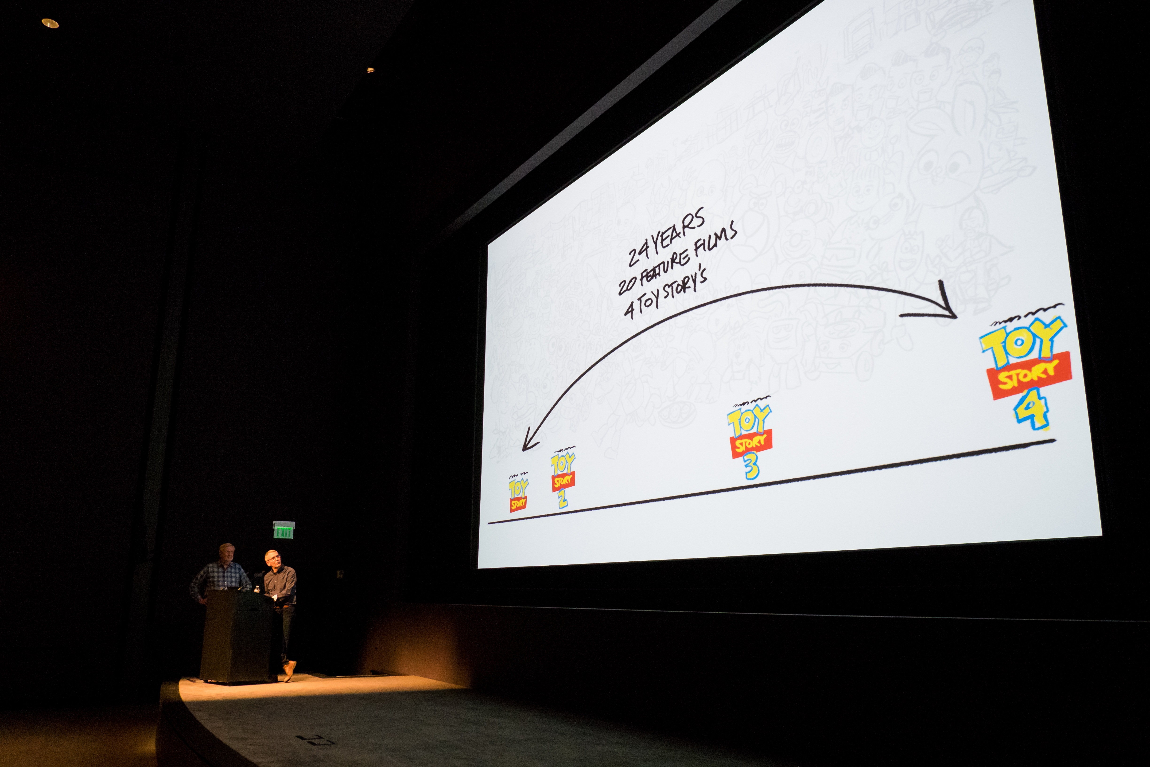
Last month, I was fortunate to visit Pixar (for the second time!) to learn about the making of Toy Story 4. One of the first presentations was centered on The Evolution of the Toy Story World.

TOY STORY 4 (Pictured): (L-R) Bill Reeves (Global Technology Supervisor) & Bob Pauley (Production Designer) present the “EVOLUTION OF THE TOY STORY WORLD.” Photo by Marc Flores. ©2019 Disney/Pixar. All Rights Reserved.
Myself and other bloggers and journalists from various outlets were gathered in the Pixar theater to learn about the design principles in this world that I’m so happy we get to revisit! Our presenters were production designer Bob Pauley and global technology supervisor Bill Reeves, who guided us through all four films in the franchise.
It’s the early ’90s. Pixar is much smaller than it is today. For Toy Story, the studio’s first feature length film, there’s just 16 people on the film crew. At this point, there’s no art or story or editorial departments. In fact, there’s only three animators on the team who will eventually become 50; 10 technical directors grow to 70; and the art department gains a whopping four. Toy Story is an hour and 21 minutes long, but Pixar’s one theatrical film under their belt at that time (“Tin Toy”) had merely a five minute runtime. So there were lots of external pressures in addition to the design challenges we learned about in this presentation.
The software back in 1995 was rudimentary, so the filmmakers relied on basic shapes. Since the film is about toys, they were in luck: plastic was easy to work with using the tools they had. Pixar’s Renderman is world renowned today, but 24 years ago, all of the rendering, lighting, and layout were done with just a simple text editor. To get a better idea of the restrictions in the software, look no further than the Dinoco gas station. The lighting in that set used six to seven light sources, but today, that number would be 300 or more.
Still, despite the primitive software, which included only basic rigging (what animators use to animate), the filmmakers did take pride in their work. Bob Pauley noted fondly that they amazed themselves with the first sequence of the green army men. That sequence offered them a glimpse into the exciting world they were building. And no one can deny how Toy Story changed the landscape of computer animation.

TOY STORY 4 (Pictured): (L-R) Bill Reeves (Global Technology Supervisor) & Bob Pauley (Production Designer) present the “EVOLUTION OF THE TOY STORY WORLD.” Photo by Marc Flores. ©2019 Disney/Pixar. All Rights Reserved.
With all of the experience gained from Toy Story, the artists moved onto Toy Story 2. The second film’s fraught history is well known, but though it was released four years after the first film, it was actually completed in just an eight month period. By this time, the software had improved somewhat. The filmmakers were able to utilize better shading, along with an interactive layout and lighting system. A Bug’s Life, Pixar’s second feature film, was also useful, as its crowd shots helped them to do the same with the robots in Toy Story 2‘s video game opening. More risks were taken with this film, and it even featured sophisticated human characters in Al and Geri the toy cleaner.
Eleven years later, Toy Story 3 made significant strides with its technology. There were ten feature length films in the studio’s library at this time, which meant the software provided more tools. For example, the hair technology in Monsters, Inc. proved quite beneficial to Toy Story 3 for Buster the dog’s fur. The models were also more organic and flexible. The lighting enriched the scenes and made space for even greater complexity, and as always, served the story. And the studio wasn’t merely acquiring advanced software during this period. There were also new artists. To hear Bill Reeves describe those artists as “new blood” speaks to Pixar’s wholehearted enthusiasm for new, fresh voices; new blood pumping into the studio’s heart!
Now with Toy Story 4 just a month away, countless artists and technicians are working with an abundant variety of textures and materials.

TOY STORY 4 (Pictured): Bob Pauley (Production Designer) presents the “EVOLUTION OF THE TOY STORY WORLD.” Photo by Marc Flores. ©2019 Disney/Pixar. All Rights Reserved.
The software now allows them to make human characters more appealing. Andy was never the focus of Toy Story, but now they have the ability to upgrade his design. With these technological improvements, the filmmakers no longer have to stick with just the basic shapes and textures they started out with. The new Renderman mimics the physics of life, which is less about making the animation look “real.” The actual concern is making it all truthful.
At the beginning of this talk, Reeves reiterated the ‘story is king’ mantra that Pixar has always championed. It’s vital to every single department on each film. What I found so illuminating in this talk, aside from the explanation of technical terms, was how the old and new technology still served the story. As I learned throughout my time there, and what I hope to convey in later posts, is how intentional Pixarians are in their work; everything is deliberate and nothing in the film is simply there by chance.
Animation, described by Reeves as one of Pixar’s crown jewels, involves much more polish in Toy Story 4. Polishing allows animators to add subtle elements to their shots that make those shots come alive. Polishing doesn’t simply make the film pretty to look at, it serves a narrative purpose. For this film and Toy Story 3, there was ten times more polishing compared to the earlier films. Take a look at the comparison shots of Bo and Woody below:

There’s much greater detail and polish in Toy Story 4. It’s how the first film might have looked if there was more time and newer software. But then, the film never would’ve been made in 1995. Despite the film’s “seat of the pants” process, it went on to become an enormous success. Even with the primitive software, Toy Story is a timeless classic with beloved characters that we’ve spent over two decades with! Seeing these shots side by side isn’t jarring. Toy Story still looks beautiful – Toy Story 4 has just enhanced its look, added depth where before there could only be simplicity. 24 years later we’re still thrilled to see Woody and Bo again, and it’s not because of how they look.
I first watched Toy Story when I was four years old. Now I’m 28 watching Toy Story 4. As impressed as I am with the film’s design and technology, what affects me the most are the characters I’ve grown up with for nearly my whole life. I’m predicting the same for everybody else when this film hits theaters in June.

As always, check back here for more posts. There’s so much I’m excited to share about Toy Story 4 and my Pixar visit! Last modified: May 1, 2019


